
 --%3E%3Csvg version='1.1' id='_x3C_Layer_x3E_' xmlns='http://www.w3.org/2000/svg' xmlns:xlink='http://www.w3.org/1999/xlink' x='0px' y='0px' viewBox='0 0 234.24 234.24' style='enable-background:new 0 0 234.24 234.24;' xml:space='preserve'%3E%3Crect x='0.029' y='0.008' style='fill:%231972B9;' width='234.24' height='234.24'/%3E%3Cg%3E%3Cg%3E%3Cpath style='fill:%23FFFFFF;' d='M24.3,63.466l-0.268-0.235v-1.679l0.268-0.235c3.828,0.179,6.782,0.269,8.865,0.269 c0.782,0,5.315-0.09,10.734-0.269c1.745-0.044,3.009-0.066,3.794-0.066c3.023,0,5.417,0.301,7.186,0.905 c1.769,0.605,3.189,1.673,4.264,3.208c1.074,1.533,1.612,3.274,1.612,5.221c0,2.485-0.895,4.791-2.686,6.916 c-1.791,2.128-4.7,3.65-8.729,4.568c2.417,0.223,4.41,0.549,5.977,0.972c1.566,0.425,2.921,1.08,4.061,1.966 c1.142,0.884,2.043,2.03,2.704,3.44c0.66,1.41,0.991,3.045,0.991,4.904c0,1.454-0.225,2.933-0.672,4.433 c-0.448,1.498-1.27,2.987-2.468,4.466c-1.198,1.476-2.646,2.742-4.348,3.793c-1.701,1.052-3.441,1.815-5.222,2.283 c-1.78,0.47-3.99,0.705-6.631,0.705c-0.537,0-3.582-0.056-6.268-0.168c-2.979-0.067-4.59-0.099-4.835-0.099 c-1.523,0-3.393,0.088-5.608,0.267l-0.269-0.267v-1.109l0.269-0.334c1.298-0.583,2.048-0.986,2.249-1.21 c0.201-0.222,0.365-2.205,0.488-5.942c0.123-3.74,0.185-6.594,0.185-8.564V79.281l-0.034-7.622c0-1.657-0.022-3.006-0.067-4.046 c-0.045-1.042-0.106-1.785-0.185-2.234c-0.077-0.446-0.206-0.761-0.385-0.94s-0.431-0.329-0.756-0.453 c-0.324-0.123-0.878-0.229-1.662-0.32L24.3,63.466z M36.355,81.095c1.119,0.09,2.384,0.135,3.795,0.135 c4.633,0,9.289-0.828,11.103-2.486c1.813-1.656,2.719-3.929,2.719-6.815c0-1.679-0.347-3.106-1.042-4.283 c-0.693-1.174-1.785-2.076-3.274-2.702c-1.488-0.628-4.941-0.942-7.493-0.942c-2.081,0-3.918,0.169-5.507,0.504 c-0.202,2.015-0.302,5.529-0.302,10.543V81.095z M36.422,105.573c1.724,0.403,3.493,0.604,5.305,0.604 c3.2,0,7.142-0.515,8.954-1.543c1.814-1.031,3.15-2.458,4.013-4.283c0.861-1.825,1.293-3.811,1.293-5.96 c0-3.223-0.911-5.802-2.736-7.739c-1.824-1.937-7.202-2.904-13.27-2.904c-1.007,0-2.216,0.044-3.626,0.133v11.452L36.422,105.573z '/%3E%3Cpath style='fill:%23FFFFFF;' d='M68.331,108.914v-1.589l0.44-0.325l0.108-0.004c1.568-0.066,2.622-0.15,3.133-0.246 c0.632-0.119,0.837-0.253,0.895-0.307c0.055-0.048,0.197-0.225,0.324-0.827c0.106-0.491,0.168-1.636,0.185-3.404l0.026-5.311 v-11.66l-0.052-4.907c-0.015-1.887-0.063-3.117-0.137-3.656c-0.09-0.655-0.223-0.862-0.274-0.921 c-0.063-0.071-0.248-0.213-0.757-0.342c-0.299-0.078-1.123-0.185-3.342-0.267l-0.125-0.004l-0.425-0.366V73.19l0.439-0.375 l0.14,0.006c3.115,0.133,5.572,0.202,7.305,0.202c1.922,0,4.555-0.06,7.822-0.176c1.224-0.035,2.109-0.05,2.659-0.05 c4.473,0,7.438,0.792,9.065,2.421c1.604,1.608,2.417,3.54,2.417,5.744c0,1.464-0.395,2.921-1.177,4.327 c-0.778,1.406-1.941,2.622-3.455,3.615c-1.397,0.915-3.3,1.627-5.661,2.121c0.506,0.674,1.256,1.654,2.254,2.938l3.649,4.736 c1.182,1.562,2.449,3.208,3.799,4.946c1.728,2.22,2.318,2.742,2.516,2.857c0.357,0.204,0.659,0.33,0.9,0.374 c0.259,0.046,0.693,0.068,1.285,0.068h0.146l0.418,0.41v1.484l-0.463,0.453l-0.171-0.021c-0.804-0.099-1.775-0.15-2.885-0.15 c-1.203,0-2.533,0.05-3.956,0.151l-0.183,0.013l-0.116-0.14c-1.181-1.406-3.06-3.88-5.59-7.347 c-2.921-3.999-5.957-7.76-9.019-11.179l-0.139-0.155l0.409-1.238l0.275,0.017c0.881,0.048,1.568,0.074,2.06,0.074 c2.863,0,5.129-0.676,6.732-2.009c1.608-1.333,2.388-3.138,2.388-5.516c0-2.118-0.693-3.666-2.118-4.738 c-1.437-1.081-3.421-1.629-5.898-1.629c-1.695,0-3.317,0.225-4.823,0.667c-0.103,0.409-0.29,2.149-0.29,9.15v11.661l0.025,4.908 c0.016,1.868,0.068,3.086,0.149,3.625c0.102,0.656,0.235,0.865,0.288,0.925c0.064,0.074,0.249,0.218,0.764,0.357 c0.298,0.081,1.117,0.196,3.335,0.278L83.739,107l0.44,0.325v1.589l-0.417,0.41h-0.148c-0.086,0-1.596-0.052-4.533-0.153 c-1.209-0.032-2.156-0.05-2.84-0.05c-0.525,0-2.991,0.067-7.336,0.203l-0.152,0.004L68.331,108.914z'/%3E%3Cpath style='fill:%23FFFFFF;' d='M123.441,110.053c-2.372,0-4.505-0.267-6.332-0.795c-1.844-0.532-3.322-1.249-4.397-2.132 c-1.078-0.887-1.864-1.838-2.337-2.829c-0.468-0.982-0.776-2.148-0.914-3.467c-0.136-1.29-0.204-3.282-0.204-5.917v-9.671 l-0.052-4.909c-0.015-1.89-0.061-3.12-0.134-3.656c-0.089-0.655-0.218-0.864-0.268-0.923c-0.063-0.072-0.241-0.212-0.738-0.341 c-0.294-0.075-1.1-0.183-3.274-0.264l-0.127-0.006l-0.418-0.367v-1.584l0.43-0.376l0.141,0.005c4.141,0.133,6.56,0.2,7.192,0.2 c0.564,0,2.991-0.067,7.217-0.2l0.141-0.005l0.43,0.376v1.584l-0.42,0.368l-0.129,0.005c-1.145,0.033-2.038,0.083-2.655,0.148 c-0.711,0.075-1.054,0.217-1.216,0.323c-0.109,0.071-0.305,0.298-0.407,1.044c-0.089,0.66-0.134,1.598-0.134,2.785l-0.05,5.795 v8.004c0,2.615,0.055,4.556,0.162,5.773c0.106,1.192,0.334,2.205,0.678,3.015c0.337,0.791,0.858,1.483,1.55,2.055 c0.694,0.579,1.719,1.061,3.04,1.43c1.34,0.376,2.882,0.565,4.588,0.565c1.802,0,3.506-0.252,5.065-0.75 c1.533-0.49,2.711-1.203,3.503-2.121c0.791-0.921,1.319-2.152,1.567-3.666c0.257-1.559,0.385-3.764,0.385-6.552v-7.757 c0-1.308-0.022-3.107-0.063-5.396c-0.056-3.035-0.206-3.675-0.269-3.811c-0.12-0.261-0.348-0.457-0.692-0.6 c-0.265-0.107-1.074-0.246-3.434-0.286l-0.145-0.003l-0.408-0.408v-1.469l0.407-0.458l0.172,0.01c2.467,0.133,4.468,0.2,5.95,0.2 c1.264,0,3.257-0.067,5.924-0.2l0.147-0.008l0.456,0.406v1.53l-0.446,0.397l-0.132,0.003c-1.55,0.033-2.569,0.095-3.024,0.182 c-0.507,0.099-0.731,0.229-0.828,0.322c-0.141,0.136-0.25,0.366-0.327,0.681c-0.059,0.248-0.137,1.012-0.179,3.248l-0.076,5.665 v7.65c0,3.059-0.119,5.507-0.355,7.277c-0.242,1.812-0.794,3.328-1.638,4.507c-0.835,1.161-1.84,2.146-2.986,2.93 c-1.148,0.786-2.633,1.398-4.414,1.817C127.199,109.843,125.341,110.053,123.441,110.053'/%3E%3Cpath style='fill:%23FFFFFF;' d='M166.203,110.053c-6.125,0-11.175-1.767-15.012-5.255c-3.845-3.496-5.795-8.126-5.795-13.763 c0-3.881,0.972-7.326,2.893-10.234c1.917-2.905,4.483-5.109,7.629-6.551c3.129-1.434,6.693-2.16,10.588-2.16 c2.248,0,4.502,0.239,6.699,0.713c2.197,0.473,4.059,1.049,5.535,1.711l0.09,0.041l0.347,0.493l-0.075,0.182 c-0.371,0.903-0.726,3.215-1.057,6.871l-0.012,0.116l-0.36,0.411h-1.494l-0.402-0.402l-0.251-4.255 c-1.162-0.895-2.576-1.609-4.204-2.12c-1.694-0.532-3.485-0.802-5.321-0.802c-2.763,0-5.274,0.6-7.46,1.784 c-2.176,1.177-3.89,2.908-5.093,5.143c-1.208,2.245-1.821,5.038-1.821,8.304c0,3.28,0.722,6.194,2.143,8.66 c1.42,2.465,3.386,4.386,5.841,5.707c2.462,1.325,5.382,1.997,8.682,1.997c1.463,0,2.887-0.14,4.234-0.42 c1.344-0.28,2.476-0.625,3.361-1.033c0.89-0.408,1.755-0.915,2.572-1.501l0.275-0.197l0.775,0.954l-1.089,2.662l-0.119,0.06 C174.543,109.084,170.471,110.053,166.203,110.053'/%3E%3Cpath style='fill:%23FFFFFF;' d='M184.053,108.912v-1.104l0.328-0.411l0.069-0.035c1.341-0.681,1.583-0.856,1.626-0.893 c-0.012-0.042,0.118-0.694,0.23-4.151c0.092-2.794,0.139-4.956,0.139-6.423v-9.242l-0.026-5.715c0-1.238-0.016-2.245-0.05-3.021 c-0.032-0.752-0.087-1.293-0.167-1.603c-0.092-0.371-0.178-0.514-0.219-0.566c-0.048-0.057-0.15-0.145-0.378-0.231 c-0.148-0.056-0.469-0.139-1.161-0.218l-2.019-0.16l-0.413-0.361v-1.585l0.428-0.374l0.138,0.003 c5.731,0.099,9.447,0.15,11.05,0.15c5.477,0,10.423-0.052,14.698-0.15l0.19-0.004l0.333,0.466l-0.042,0.163 c-0.411,1.582-0.722,4.107-0.922,7.51l-0.006,0.109l-0.323,0.43h-1.549l-0.467-0.414l0.021-0.185 c0.014-0.136,0.022-0.256,0.022-0.364c0-1.329-0.098-2.616-0.291-3.827c-1.003-0.41-2.38-0.684-4.101-0.814 c-1.854-0.142-3.264-0.213-4.19-0.213c-1.241,0-2.833,0.082-4.738,0.247l-0.091,3.709l-0.146,9.373 c1.669,0.087,3.231,0.132,4.649,0.132c1.524,0,2.818-0.05,3.844-0.148c1.379-0.134,1.636-0.243,1.673-0.263 c0.094-0.059,0.18-0.207,0.245-0.428c0.086-0.286,0.162-0.817,0.227-1.577l0.108-1.689l0.403-0.401h1.454l0.414,0.414 l-0.003,0.152c-0.034,1.831-0.076,3.67-0.126,5.519l0.129,5.801l-0.414,0.416h-1.454l-0.396-0.396l-0.19-1.634 c-0.183-1.428-0.272-1.9-0.315-2.043c-0.043-0.147-0.15-0.277-0.325-0.399c-0.087-0.059-0.429-0.211-1.71-0.34 c-0.99-0.101-2.376-0.15-4.119-0.15c-0.916,0-2.289,0.038-4.118,0.111c-0.071,1.427-0.107,3.68-0.107,6.709 c0,3.271,0.036,5.766,0.108,7.422h4.293c4.049,0,6.613-0.05,7.621-0.148c0.93-0.092,1.829-0.309,2.674-0.646 c0.148-0.429,0.376-1.268,0.679-2.496c0.337-1.384,0.536-2.255,0.583-2.595l0.022-0.155l0.471-0.33h1.457l0.46,0.403l-0.043,0.206 c-0.145,0.704-0.291,1.96-0.434,3.734c-0.143,1.777-0.213,3.319-0.213,4.578v0.134l-0.376,0.431l-0.169-0.006 c-3.189-0.099-7.421-0.15-12.581-0.15l-6.852-0.052c-1.575,0-3.244,0.067-4.956,0.201l-0.165,0.011L184.053,108.912z'/%3E%3C/g%3E%3Cg%3E%3Cpath style='fill:%23FFFFFF;' d='M89.628,166.088l-1.251,3.124c-4.869,2.528-10.068,3.793-15.597,3.793 c-7.92,0-14.352-2.293-19.299-6.883c-4.947-4.589-7.421-10.587-7.421-17.997c0-5.105,1.234-9.564,3.702-13.381 c2.468-3.817,5.725-6.671,9.773-8.562c4.048-1.892,8.595-2.838,13.64-2.838c2.919,0,5.804,0.314,8.655,0.939 c2.851,0.628,5.231,1.377,7.141,2.251l0.231,0.335c-0.505,1.254-0.978,4.354-1.416,9.301l-0.231,0.269H86.01l-0.264-0.269 l-0.329-5.708c-1.603-1.298-3.538-2.311-5.809-3.039c-2.271-0.728-4.634-1.092-7.091-1.092c-3.708,0-7.032,0.811-9.97,2.434 c-2.941,1.623-5.221,3.974-6.847,7.052c-1.62,3.079-2.433,6.844-2.433,11.3c0,4.477,0.954,8.404,2.862,11.785 c1.909,3.382,4.515,5.977,7.815,7.79c3.3,1.813,7.157,2.72,11.567,2.72c1.952,0,3.828-0.189,5.627-0.571 c1.799-0.38,3.296-0.851,4.491-1.41c1.196-0.56,2.342-1.242,3.439-2.047L89.628,166.088z'/%3E%3Cpath style='fill:%23FFFFFF;' d='M93.747,171.912v-1.104l0.327-0.41l0.067-0.036c1.337-0.688,1.574-0.866,1.614-0.904 c-0.011-0.025,0.087-0.518,0.221-3.026c0.108-2.033,0.162-4.518,0.162-7.385v-10.804l-0.05-4.908 c-0.017-1.89-0.063-3.121-0.134-3.658c-0.09-0.655-0.218-0.863-0.269-0.921c-0.062-0.071-0.241-0.212-0.74-0.341 c-0.292-0.076-1.098-0.183-3.272-0.265l-0.127-0.006l-0.418-0.366v-1.585l0.431-0.375l0.14,0.004 c4.14,0.133,6.559,0.201,7.191,0.201c0.565,0,2.991-0.068,7.217-0.201l0.14-0.004l0.431,0.375v1.585l-0.42,0.368l-0.129,0.004 c-1.145,0.033-2.037,0.083-2.656,0.149c-0.711,0.075-1.052,0.216-1.217,0.323c-0.106,0.07-0.302,0.298-0.404,1.044 c-0.091,0.661-0.136,1.597-0.136,2.785l-0.05,5.794v11.129c0,2.783,0.017,4.726,0.05,5.831l0.115,4.01h4.791 c4.066,0,6.635-0.05,7.633-0.148c0.926-0.092,1.832-0.311,2.695-0.649c0.171-0.456,0.414-1.363,0.719-2.7 c0.442-1.949,0.523-2.444,0.532-2.565l0.011-0.147l0.436-0.388h1.534l0.4,0.457l-0.035,0.171c-0.13,0.655-0.267,1.953-0.41,3.862 c-0.143,1.911-0.213,3.478-0.213,4.656v0.148l-0.417,0.417l-0.154-0.006c-3.172-0.099-7.396-0.15-12.555-0.15l-7.357-0.052 c-1.659,0-3.377,0.067-5.107,0.201l-0.165,0.011L93.747,171.912z'/%3E%3Cpath style='fill:%23FFFFFF;' d='M160.736,172.322c-1.762-0.15-3.369-0.225-4.779-0.225c-2.777,0.085-5.566,0.159-8.353,0.227 l-0.153,0.004l-0.415-0.415v-1.606l0.408-0.409l0.144-0.003c2.296-0.041,3.138-0.146,3.441-0.227 c0.386-0.104,0.439-0.311,0.439-0.522c0-0.323-0.109-0.772-0.327-1.331l-3.005-7.453h-14.104l-2.651,6.229 c-0.466,1.107-0.702,1.915-0.702,2.402c0,0.185,0.053,0.423,0.467,0.604c0.28,0.126,1.076,0.277,3.284,0.297l0.133,0.003 l0.448,0.396v1.619l-0.42,0.423l-0.162-0.011c-2.148-0.133-4.055-0.2-5.669-0.2c-1.83,0-3.702,0.067-5.566,0.2l-0.151,0.011 l-0.459-0.409v-1.633l0.446-0.396l0.133-0.003c1.477-0.02,2.048-0.104,2.267-0.173c0.29-0.088,0.543-0.266,0.777-0.543 c0.176-0.207,0.6-0.919,1.623-3.13l2.646-5.74l6.847-15.509c1.291-3.035,2.574-6.072,3.85-9.11l0.092-0.219h2.113l12.28,28.876 c0.417,0.951,0.898,1.987,1.44,3.106c0.716,1.472,0.981,1.812,1.061,1.889c0.172,0.165,0.392,0.294,0.652,0.386 c0.187,0.066,0.68,0.148,1.964,0.168l0.145,0.003l0.409,0.409v1.606l-0.424,0.425L160.736,172.322z M146.857,157.478 l-5.787-13.902l-5.879,13.902H146.857z'/%3E%3Cpath style='fill:%23FFFFFF;' d='M166.505,171.912v-1.585l0.434-0.326l0.11-0.006c1.57-0.064,2.609-0.147,3.093-0.243 c0.572-0.115,0.778-0.241,0.849-0.307c0.067-0.06,0.196-0.236,0.307-0.742c0.095-0.435,0.151-1.364,0.168-2.76l0.051-4.307v-4.782 c-0.334-0.749-1.571-2.927-3.65-6.335l-2.215-3.6c-0.698-1.13-1.588-2.467-2.646-3.974c-1.047-1.491-1.864-2.515-2.43-3.04 c-0.677-0.629-1.035-0.824-1.216-0.875c-0.161-0.048-0.696-0.125-2.47-0.125h-0.148l-0.437-0.437v-1.354l0.413-0.412l7.385-1.227 l0.12,0.083c0.523,0.367,1.041,0.835,1.536,1.39c0.495,0.558,1.191,1.559,2.125,3.058c0.915,1.467,2.109,3.542,3.548,6.162 c1.336,2.431,2.639,4.899,3.878,7.342l2.229-3.545l2.892-4.828l5.454-9.338l0.231,0.025c0.638,0.064,1.271,0.099,1.876,0.099 c0.379,0,0.957-0.034,1.732-0.099l0.167-0.014l0.424,0.424v0.765l-0.094,0.102c-0.826,0.91-2.131,2.59-3.878,4.994 c-1.75,2.408-3.071,4.317-3.929,5.672c-0.863,1.367-1.924,3.086-3.182,5.157c-1.54,2.537-1.952,3.384-2.026,3.652 c-0.109,0.385-0.164,0.854-0.164,1.389v3.702l0.025,3.775c0.017,1.434,0.07,2.446,0.16,3.007c0.113,0.708,0.25,0.904,0.29,0.949 c0.063,0.07,0.241,0.204,0.732,0.334c0.287,0.077,1.086,0.183,3.26,0.264L181.62,170l0.435,0.326v1.585l-0.413,0.411h-0.148 c-0.084,0-1.566-0.05-4.445-0.15c-1.185-0.035-2.114-0.052-2.783-0.052c-0.53,0-2.951,0.068-7.191,0.201l-0.155,0.006 L166.505,171.912z'/%3E%3Cpath style='fill:%23FFFFFF;' d='M190.461,172.648c-0.73,0-1.434-0.193-2.089-0.568c-0.656-0.378-1.167-0.898-1.518-1.55 c-0.35-0.646-0.526-1.633-0.526-2.323c0-0.693,0.176-1.062,0.526-1.707c0.35-0.646,0.86-1.168,1.518-1.547 c0.653-0.379,1.359-0.571,2.089-0.571c0.729,0,1.422,0.186,2.06,0.554c0.638,0.365,1.147,0.877,1.517,1.519 c0.367,0.641,0.553,1.333,0.553,2.061c0,0.737-0.186,1.431-0.553,2.068c-0.367,0.636-0.877,1.146-1.511,1.511 C191.891,172.461,191.196,172.648,190.461,172.648 M190.461,165.157c-0.594,0-1.167,0.157-1.701,0.462 c-0.533,0.305-0.947,0.728-1.23,1.254c-0.284,0.531-0.43,1.083-0.43,1.644c0,0.577,0.147,1.132,0.438,1.657 c0.288,0.522,0.698,0.942,1.224,1.244c0.526,0.306,1.097,0.459,1.698,0.459c0.592,0,1.154-0.15,1.675-0.448 c0.518-0.296,0.935-0.712,1.234-1.234c0.301-0.52,0.452-1.086,0.452-1.678c0-0.599-0.151-1.163-0.452-1.679 c-0.299-0.516-0.715-0.93-1.231-1.23C191.62,165.308,191.056,165.157,190.461,165.157 M192.117,170.692 c-0.211,0-0.372-0.025-0.495-0.077c-0.133-0.055-0.252-0.169-0.354-0.34c-0.088-0.15-0.225-0.454-0.407-0.91 c-0.113-0.291-0.188-0.417-0.231-0.476c-0.056-0.073-0.115-0.126-0.175-0.157c-0.027-0.014-0.118-0.046-0.396-0.046H189.9v1.227 c0,0.221,0.016,0.276,0.018,0.281c0.021,0.018,0.063,0.038,0.225,0.038l0.288,0.011v0.448h-1.95v-0.448l0.287-0.011 c0.165,0,0.207-0.017,0.211-0.02c0.02-0.034,0.035-0.097,0.035-0.299v-3.078c0-0.234-0.024-0.29-0.024-0.291 c-0.032-0.018-0.102-0.031-0.369-0.033l-0.14-0.003v-0.456h1.942c0.269,0,0.519,0.024,0.744,0.073 c0.239,0.052,0.42,0.12,0.551,0.215c0.13,0.092,0.239,0.221,0.326,0.385c0.085,0.165,0.127,0.35,0.127,0.55 c0,0.316-0.113,0.599-0.343,0.839c-0.148,0.155-0.347,0.276-0.595,0.361c0.004,0.003,0.008,0.006,0.013,0.008 c0.105,0.081,0.207,0.197,0.306,0.355c0.092,0.146,0.21,0.378,0.35,0.694c0.178,0.406,0.276,0.549,0.318,0.598 c0.071,0.083,0.218,0.103,0.33,0.108l0.137,0.004v0.449H192.117z M190.059,168.179c0.429,0,0.747-0.067,0.939-0.204 c0.179-0.126,0.267-0.33,0.267-0.618c0-0.551-0.283-0.807-0.89-0.807h-0.316c-0.095,0-0.123,0.013-0.123,0.013 c-0.025,0.026-0.035,0.067-0.035,0.246v1.371H190.059z'/%3E%3C/g%3E%3C/g%3E%3C/svg%3E%0A)

How to Know If You’re at Risk When Google Switches to a Mobile-First Index (Flowchart)
I’d like to put your minds at ease. Or alert you to an upcoming risk. I guess we’ll see which camp you’re in.
Over the course of the year, Google is going to turn up the dial on its mobile-first index. What’s that? Google is moving toward analyzing and ranking the mobile version of websites and not the desktop version, as they do now.
Exactly when the switch will be is 100% a mystery. Gary Illyes suggested it could be in 2018. Yet, we know that Google rolls out algorithm and infrastructure changes gradually and with plenty of testing. We are likely witnessing mobile-first SERPs today to some degree.
With the switch to a mobile-first index, you’ll either be in good shape or you’re going to feel the pain of a major loss in organic search traffic.
As an SEO services company, we are busy doing risk assessments for clients and identifying exactly how ready a website is for the mobile-first index.
To help you get a sense of how prepared you are for a Google index that’s focused on the mobile website experience, we created a decision tree to assess a website as low risk or high risk. For a refresher on how to satisfy a mobile searcher, take a look at our SEO Guide step on Mobile SEO and UX Optimization.
What does your path to mobile-first index readiness look like? Here’s what we look for when we do a mobile-first readiness analysis of a client’s site.

Assessing Your Risk in Google’s Mobile-First Index
This agency signed on to the mission of helping businesses succeed online, but when more and more factors are rapidly changing, our ability to institute timely change diminishes. So, we want everyone to know what’s at stake if every action taken isn’t mobile-friendly.
If a client’s site does not perform well on a mobile browser, then this is a problem. The mobile experience is how we serve connected consumers. If there is any issue, then it’s our job as the SEO expert to discuss this risk with our clients.
If a client has a mobile-friendly site, then it’s our job to evaluate if the mobile site contains the same content as served on the desktop. If the content is different, then the client is at risk.
If a client is unable to optimize for site speed or for conversions, or if they are not working on a solution to a mobile-friendly site, then this client should acknowledge the risk of losing rankings.
How do we check if a client site is going to suffer a drop in rankings and traffic when the mobile-first index goes live?
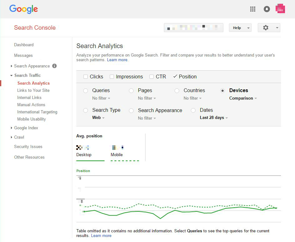
Right at this moment, we can look at Google Search Console to compare mobile and desktop rankings. You can too.
How to Compare Your Mobile Rankings and Desktop Rankings in Google Search Console
- Go to your site in Google Search Console.
- Go to Search Traffic > Search Analytics.
- Select “Position” and “Devices”.
- Select the filter to compare mobile vs. desktop.
- Is your average position for mobile higher or lower than for desktop?
If your average mobile rankings are worse than your average desktop rankings, then you’re at risk when the mobile-first index switch occurs.
Calculating the Impact on Your Business
If I could stress three things, then they would be:
- To be mobile-friendly goes beyond having a responsive website. It’s critical to match the content on the desktop site to the mobile user experience. A mobile-friendly website doesn’t merely mimic the desktop. In fact, a responsive site can have lower conversion rates if the mobile UX isn’t optimized. What value does your mobile experience provide to help the consumer want to do business with you?
- If you don’t have a mobile-friendly site, then get started on your update now. Some content management systems (CMS’s) don’t produce mobile experiences. Do you have a solution in place? What is it? How fast can you implement it? Since you may already be late to the party, have a look at our All-In-One Mobile SEO & Design Checklist
- Please understand that “mobile first” relates to the Google index being based upon the mobile displayed content. It does not mean that desktop is dead. There are many reasons that in your business that “desktop first” may apply. For whether or not this applies to you, you may want to consult with an expert mobile SEO agency.
I’m not trying to create fear, but I am hoping to convey a risk.
What else can you do to make sure your business is well positioned when Google flips the switch and turns on its mobile-first index?
People generally understand how much traffic they’re getting from Google in the desktop-focused index environment. Meanwhile, we have no idea how much traffic will be affected after the switch to a mobile-focused index. We want you in the best possible position when the change to a mobile-first index rolls out.
We are convinced that mobile readiness is vital to the future of your business. To help you, we have designed our SEO Services to offer you powerful insights into your mobile readiness. Ensure your mobile-first SEO strategy is on track with a second pair of expert eyes on your site.
A typical report may include assessment of the following:
- Mobile friendliness
- Page speed
- Content matching
- Mobile navigation
- Mobile interstitials
- Security issues
- Indexing and robots directives
- Schema markup

Or give us a call at 866-517-1900 during business hours Pacific time and our team will be happy to answer any questions you have about the mobile-first index shift and developing your mobile SEO strategy.


44 Replies to “How to Know If You’re at Risk When Google Switches to a Mobile-First Index (Flowchart)”
Awesome article! It provides valuable insights into the mobile-first index and emphasizes the significance of having a speedy mobile website. The section on comparing mobile rankings to desktop rankings in Google Search Console is particularly helpful. Understanding the differences between the two can greatly impact our SEO strategy and overall website performance. Thank you for sharing this informative content that highlights the importance of optimizing for mobile devices.
Amazing post. Indeed if your website is not SEO friendly then you’re at high risk. Keep sharing such amazing content
The flow chart has lots of information on optimization. If your website is based on only content then AMP is the best option but if your website is an e-commerce business then AMP is not.
According to a new Google update, Google introduces Web Stories for mobile users. So as an advice, you all need to analyze the business model and implement the best way for SEO.
Mobile-first indexing means Google predominantly uses the mobile version of the content for indexing and ranking. Historically, the index primarily used the desktop version of a page’s content when evaluating the relevance of a page to a user’s query.
Hii. Thanks for sharing info. I was wondering, is SEO in mobile different than in desktop?
Hi Hitesh,
SEO must focus on mobile because Google has switched to a “mobile-first index.” This means that whatever shows to mobile users is what counts for ranking purposes. Mobile-friendliness is also a ranking signal in Google and Bing.
Once you earn search traffic to your website, of course, you want to optimize the user experience for both mobile and desktop users. But for ranking purposes, it’s mobile that counts. Learn more about mobile SEO here: https://www.bruceclay.com/seo/mobile-seo/
Thanks,
This article has served its purpose and put me on the road to not only making my site responsive but also making it more mobile-friendly. Thanks for sharing such information with us.
Hey Bruce Clay,
Good information on Google Switches to a Mobile-First Index.
The mobile users are very important in Digital Marketing.
Thanks Bruce :-)
Hi Alex – In Google Analytics, you can see what percentage of your traffic comes from desktop (which includes laptop computers), tablet, and mobile devices. You can also filter the various reports by device. (If you don’t have Google Analytics installed yet on your site, don’t miss out! It’s free software from Google.)
Excellent article. Thanks for sharing with us this great information. I had no idea about that the SEO techniques are different in the mobile device. It will be really helpful.
Thank you so much for educating us, I have bookmarked this page for future references. Can you tell me more about Ahref?
This is a really useful flowchart, thanks guys. It seems I’ve got some work to do before the mobile-first indexation hits though :(
Great post! Good information on the mobile-first index and the importance of a fast mobile version of your website. Very helpful about comparing mobile rankings vs desktop rankings in Google Search Console.
Great advice. Currently it looks like at least our own site mobile is ahead of desktop so it seems there isn’t risk. Definitely need to audit a ton of clients now though!
Hi Bruce. Thanks for the article. I was wondering, is SEO in mobile different than in desktop?
AMP pages are very important nowadays and Google gives higher priority to AMP rather than Non-AMP version.
I guess all the webmasters should use AMP version for their blogs because 80% traffic is from Mobile devices nowadays.
Paytm: AMP isn’t the right solution for every site. With some types of content, AMP can help put you in the running, such as when the competitors in your space are all on AMP. However, some content wouldn’t translate well to AMP, and it’s not necessary to implement it. There are also alternatives for fast mobile delivery of your site.
In my opinion, this is logical. More and more people use mobile phones and tablet more often than laptops. Consequently, Google cares about the comfort of its users and want to provide everybody with the ease of use. I totally accept this innovation.
Mobile stuff is very much important while indexing our URL in Google. How the AMP working for this can you please explain?
Thanks for sharing this chart, this is a great checklist! While more and more searches are made from mobiles, Google’s step will improve users experience. However, for us SEOs, there are many elements to address for our clients in the short term, as when looking at past major releases, I believe Google will probably not wait as long as we think to switch!
With PPC, you effectually skip over the middle circle which cost you. By avoiding your prospects’ inboxes, you’re only competing with marketers on a SERP, a pertinent website on the GDN, or Facebook / Instagram. You’re also getting a leg up on your contestants, who are probably only using an automatic email funnel to nurture prospects (if they’re doing it at all).
Hi Bruce,
Just checked in Search Console after reading your post & found that mobile site is ranking 5.9 . However, my desktop site is ranking 9.8.
Does it mean that my desktop site needs to change?
Great article! Mobile is clearly taking over desktop traffic these days. We do see quite a few websites that pass the initial mobile test, but their load times are a bit slower. We always recommend further optimization.
This article has served its purpose and put me on the road to not only making my site responsive but also making it more mobile friendly. I particularly found the infographic helpful.
@ Jasa -do you use Google Search Console?
On the Search Analytics option, you can;
a) select to compare Mob vs Desktop
b) select to view Position
This will allow you to see (roughly) what sort of ranking your pages have for the different searcher types.
What Bruce is suggesting is that if the mobile data points to you ranking lower than desktop, then your site/pages may not be that mobile friendly, which will be a problem in a mobile-first index.
Hi Bruce, you said “If your average mobile rankings are worse than your average desktop rankings, you’re at risk when the mobile-first index switch occurs”, so it means average mobile rankings LOWER than average desktop rankings? how do you define “worse”?
As we all know that the next future will be about the mobile future so, each and every work will be perform on the future. So it this given detail is very new and usefull for me to add more knowledge into my ideas.
Hey Mate,
You have to keep in mind that you may have already pushed some traffic away if your site isn’t mobile-friendly, but you should still see a strong indicator of whether your site has a mobile audience (some sites still don’t really).
Great Post Bruce, I always make sure that my websites are well optimized for mobile, because not only that i get the most traffic from but also since Google has been penalizing websites with bad mobile user experience. I wish many people would listen and start paying attention to mobile first, because i think that’s the future.
I’ve been telling my clients for weeks that they need to think about mobile versions of their websites. Many of them think that this is just some kind of trend and it won’t last. That’s especially weird when they have totally local business.
Good information on the future mobile migration. I’m sure all of the proactive sites have or doing it as we speak. Should be interesting how the algorithm shifts with it.
The mobile users are very important in Digital Marketing. Now I am getting the best view by reading your article. To track mobile users where should we go?
May want to redo the inforgraphic … I had to double check and see if “implementatior” was a word :D
(1: no, 2: yes // 3rd teal Q block // 3rd of 3rd row etc.)
–
Not sure about the UX for Conversions.
It’s important from a business perspective (nice to see it covered!), but I don’t know if it’s a ranking factor.
On the other hand, there’s a few optimisations missing, such as;
* UI (widths, font/input sizing etc.)
* Pre-fetching
* Top-loading (above the fold loading before below)
–
I love the fact that you have caveat-ed several times,
and attempted to make it abundantly clear that Desktop isn’t being ditched etc. – good job!
For those wondering how important mobile is for them/their business,
look through your tracking/stats. Most analysis platforms permit segregation by device – so use it and compare.
Specifically, look at things like Bounce Rate, Time on page/site, average page views, return rate etc.
You have to keep in mind that you may have already pushed some traffic away if your site isn’t mobile-friendly, but you should still see a strong indicator of whether your site has a mobile audience (some sites still don’t really).
This doesn’t mean you don’t have to implement a mobile push!
Even if you’ve only got 3% of visitors using such devices – you should still pay attention. G have been moving towards mobile for years and years, it’s not going to go away.
It just means that some of you don’t have to rush as much as many others (and it is going to be “many” – in most cases I’m seeing 20%+ mobile/tablet users – that’s a huge share and potential earning loss!).
Hey J. Good to see you here. I’m coming to enjoy your thoughtful comments. Don’t spoil us now! ;)
We updated the infographic so the “n” looks more like an “n” rather than an “r” in the zoomed out size. Thanks for the heads up.
Everything you say here is on point — from mobile optimizations and UX for conversion, to the argument for implementing a mobile push for your business, even if your current traffic makeup is predominantly desktop.
And for this bit: “I’m seeing 20%+ mobile/tablet users – that’s a huge share and potential earning loss!” yeah, that’s a big chunk of visitors, certainly warranting some consideration. It’s not too late, for sure. But don’t wait until it is! Thanks again, J.
This is naturally a high level. The next level might include: AMP,
Deep Linking and App’s.
LEAVE A REPLY

Contact Us Now.


