
 --%3E%3Csvg version='1.1' id='_x3C_Layer_x3E_' xmlns='http://www.w3.org/2000/svg' xmlns:xlink='http://www.w3.org/1999/xlink' x='0px' y='0px' viewBox='0 0 234.24 234.24' style='enable-background:new 0 0 234.24 234.24;' xml:space='preserve'%3E%3Crect x='0.029' y='0.008' style='fill:%231972B9;' width='234.24' height='234.24'/%3E%3Cg%3E%3Cg%3E%3Cpath style='fill:%23FFFFFF;' d='M24.3,63.466l-0.268-0.235v-1.679l0.268-0.235c3.828,0.179,6.782,0.269,8.865,0.269 c0.782,0,5.315-0.09,10.734-0.269c1.745-0.044,3.009-0.066,3.794-0.066c3.023,0,5.417,0.301,7.186,0.905 c1.769,0.605,3.189,1.673,4.264,3.208c1.074,1.533,1.612,3.274,1.612,5.221c0,2.485-0.895,4.791-2.686,6.916 c-1.791,2.128-4.7,3.65-8.729,4.568c2.417,0.223,4.41,0.549,5.977,0.972c1.566,0.425,2.921,1.08,4.061,1.966 c1.142,0.884,2.043,2.03,2.704,3.44c0.66,1.41,0.991,3.045,0.991,4.904c0,1.454-0.225,2.933-0.672,4.433 c-0.448,1.498-1.27,2.987-2.468,4.466c-1.198,1.476-2.646,2.742-4.348,3.793c-1.701,1.052-3.441,1.815-5.222,2.283 c-1.78,0.47-3.99,0.705-6.631,0.705c-0.537,0-3.582-0.056-6.268-0.168c-2.979-0.067-4.59-0.099-4.835-0.099 c-1.523,0-3.393,0.088-5.608,0.267l-0.269-0.267v-1.109l0.269-0.334c1.298-0.583,2.048-0.986,2.249-1.21 c0.201-0.222,0.365-2.205,0.488-5.942c0.123-3.74,0.185-6.594,0.185-8.564V79.281l-0.034-7.622c0-1.657-0.022-3.006-0.067-4.046 c-0.045-1.042-0.106-1.785-0.185-2.234c-0.077-0.446-0.206-0.761-0.385-0.94s-0.431-0.329-0.756-0.453 c-0.324-0.123-0.878-0.229-1.662-0.32L24.3,63.466z M36.355,81.095c1.119,0.09,2.384,0.135,3.795,0.135 c4.633,0,9.289-0.828,11.103-2.486c1.813-1.656,2.719-3.929,2.719-6.815c0-1.679-0.347-3.106-1.042-4.283 c-0.693-1.174-1.785-2.076-3.274-2.702c-1.488-0.628-4.941-0.942-7.493-0.942c-2.081,0-3.918,0.169-5.507,0.504 c-0.202,2.015-0.302,5.529-0.302,10.543V81.095z M36.422,105.573c1.724,0.403,3.493,0.604,5.305,0.604 c3.2,0,7.142-0.515,8.954-1.543c1.814-1.031,3.15-2.458,4.013-4.283c0.861-1.825,1.293-3.811,1.293-5.96 c0-3.223-0.911-5.802-2.736-7.739c-1.824-1.937-7.202-2.904-13.27-2.904c-1.007,0-2.216,0.044-3.626,0.133v11.452L36.422,105.573z '/%3E%3Cpath style='fill:%23FFFFFF;' d='M68.331,108.914v-1.589l0.44-0.325l0.108-0.004c1.568-0.066,2.622-0.15,3.133-0.246 c0.632-0.119,0.837-0.253,0.895-0.307c0.055-0.048,0.197-0.225,0.324-0.827c0.106-0.491,0.168-1.636,0.185-3.404l0.026-5.311 v-11.66l-0.052-4.907c-0.015-1.887-0.063-3.117-0.137-3.656c-0.09-0.655-0.223-0.862-0.274-0.921 c-0.063-0.071-0.248-0.213-0.757-0.342c-0.299-0.078-1.123-0.185-3.342-0.267l-0.125-0.004l-0.425-0.366V73.19l0.439-0.375 l0.14,0.006c3.115,0.133,5.572,0.202,7.305,0.202c1.922,0,4.555-0.06,7.822-0.176c1.224-0.035,2.109-0.05,2.659-0.05 c4.473,0,7.438,0.792,9.065,2.421c1.604,1.608,2.417,3.54,2.417,5.744c0,1.464-0.395,2.921-1.177,4.327 c-0.778,1.406-1.941,2.622-3.455,3.615c-1.397,0.915-3.3,1.627-5.661,2.121c0.506,0.674,1.256,1.654,2.254,2.938l3.649,4.736 c1.182,1.562,2.449,3.208,3.799,4.946c1.728,2.22,2.318,2.742,2.516,2.857c0.357,0.204,0.659,0.33,0.9,0.374 c0.259,0.046,0.693,0.068,1.285,0.068h0.146l0.418,0.41v1.484l-0.463,0.453l-0.171-0.021c-0.804-0.099-1.775-0.15-2.885-0.15 c-1.203,0-2.533,0.05-3.956,0.151l-0.183,0.013l-0.116-0.14c-1.181-1.406-3.06-3.88-5.59-7.347 c-2.921-3.999-5.957-7.76-9.019-11.179l-0.139-0.155l0.409-1.238l0.275,0.017c0.881,0.048,1.568,0.074,2.06,0.074 c2.863,0,5.129-0.676,6.732-2.009c1.608-1.333,2.388-3.138,2.388-5.516c0-2.118-0.693-3.666-2.118-4.738 c-1.437-1.081-3.421-1.629-5.898-1.629c-1.695,0-3.317,0.225-4.823,0.667c-0.103,0.409-0.29,2.149-0.29,9.15v11.661l0.025,4.908 c0.016,1.868,0.068,3.086,0.149,3.625c0.102,0.656,0.235,0.865,0.288,0.925c0.064,0.074,0.249,0.218,0.764,0.357 c0.298,0.081,1.117,0.196,3.335,0.278L83.739,107l0.44,0.325v1.589l-0.417,0.41h-0.148c-0.086,0-1.596-0.052-4.533-0.153 c-1.209-0.032-2.156-0.05-2.84-0.05c-0.525,0-2.991,0.067-7.336,0.203l-0.152,0.004L68.331,108.914z'/%3E%3Cpath style='fill:%23FFFFFF;' d='M123.441,110.053c-2.372,0-4.505-0.267-6.332-0.795c-1.844-0.532-3.322-1.249-4.397-2.132 c-1.078-0.887-1.864-1.838-2.337-2.829c-0.468-0.982-0.776-2.148-0.914-3.467c-0.136-1.29-0.204-3.282-0.204-5.917v-9.671 l-0.052-4.909c-0.015-1.89-0.061-3.12-0.134-3.656c-0.089-0.655-0.218-0.864-0.268-0.923c-0.063-0.072-0.241-0.212-0.738-0.341 c-0.294-0.075-1.1-0.183-3.274-0.264l-0.127-0.006l-0.418-0.367v-1.584l0.43-0.376l0.141,0.005c4.141,0.133,6.56,0.2,7.192,0.2 c0.564,0,2.991-0.067,7.217-0.2l0.141-0.005l0.43,0.376v1.584l-0.42,0.368l-0.129,0.005c-1.145,0.033-2.038,0.083-2.655,0.148 c-0.711,0.075-1.054,0.217-1.216,0.323c-0.109,0.071-0.305,0.298-0.407,1.044c-0.089,0.66-0.134,1.598-0.134,2.785l-0.05,5.795 v8.004c0,2.615,0.055,4.556,0.162,5.773c0.106,1.192,0.334,2.205,0.678,3.015c0.337,0.791,0.858,1.483,1.55,2.055 c0.694,0.579,1.719,1.061,3.04,1.43c1.34,0.376,2.882,0.565,4.588,0.565c1.802,0,3.506-0.252,5.065-0.75 c1.533-0.49,2.711-1.203,3.503-2.121c0.791-0.921,1.319-2.152,1.567-3.666c0.257-1.559,0.385-3.764,0.385-6.552v-7.757 c0-1.308-0.022-3.107-0.063-5.396c-0.056-3.035-0.206-3.675-0.269-3.811c-0.12-0.261-0.348-0.457-0.692-0.6 c-0.265-0.107-1.074-0.246-3.434-0.286l-0.145-0.003l-0.408-0.408v-1.469l0.407-0.458l0.172,0.01c2.467,0.133,4.468,0.2,5.95,0.2 c1.264,0,3.257-0.067,5.924-0.2l0.147-0.008l0.456,0.406v1.53l-0.446,0.397l-0.132,0.003c-1.55,0.033-2.569,0.095-3.024,0.182 c-0.507,0.099-0.731,0.229-0.828,0.322c-0.141,0.136-0.25,0.366-0.327,0.681c-0.059,0.248-0.137,1.012-0.179,3.248l-0.076,5.665 v7.65c0,3.059-0.119,5.507-0.355,7.277c-0.242,1.812-0.794,3.328-1.638,4.507c-0.835,1.161-1.84,2.146-2.986,2.93 c-1.148,0.786-2.633,1.398-4.414,1.817C127.199,109.843,125.341,110.053,123.441,110.053'/%3E%3Cpath style='fill:%23FFFFFF;' d='M166.203,110.053c-6.125,0-11.175-1.767-15.012-5.255c-3.845-3.496-5.795-8.126-5.795-13.763 c0-3.881,0.972-7.326,2.893-10.234c1.917-2.905,4.483-5.109,7.629-6.551c3.129-1.434,6.693-2.16,10.588-2.16 c2.248,0,4.502,0.239,6.699,0.713c2.197,0.473,4.059,1.049,5.535,1.711l0.09,0.041l0.347,0.493l-0.075,0.182 c-0.371,0.903-0.726,3.215-1.057,6.871l-0.012,0.116l-0.36,0.411h-1.494l-0.402-0.402l-0.251-4.255 c-1.162-0.895-2.576-1.609-4.204-2.12c-1.694-0.532-3.485-0.802-5.321-0.802c-2.763,0-5.274,0.6-7.46,1.784 c-2.176,1.177-3.89,2.908-5.093,5.143c-1.208,2.245-1.821,5.038-1.821,8.304c0,3.28,0.722,6.194,2.143,8.66 c1.42,2.465,3.386,4.386,5.841,5.707c2.462,1.325,5.382,1.997,8.682,1.997c1.463,0,2.887-0.14,4.234-0.42 c1.344-0.28,2.476-0.625,3.361-1.033c0.89-0.408,1.755-0.915,2.572-1.501l0.275-0.197l0.775,0.954l-1.089,2.662l-0.119,0.06 C174.543,109.084,170.471,110.053,166.203,110.053'/%3E%3Cpath style='fill:%23FFFFFF;' d='M184.053,108.912v-1.104l0.328-0.411l0.069-0.035c1.341-0.681,1.583-0.856,1.626-0.893 c-0.012-0.042,0.118-0.694,0.23-4.151c0.092-2.794,0.139-4.956,0.139-6.423v-9.242l-0.026-5.715c0-1.238-0.016-2.245-0.05-3.021 c-0.032-0.752-0.087-1.293-0.167-1.603c-0.092-0.371-0.178-0.514-0.219-0.566c-0.048-0.057-0.15-0.145-0.378-0.231 c-0.148-0.056-0.469-0.139-1.161-0.218l-2.019-0.16l-0.413-0.361v-1.585l0.428-0.374l0.138,0.003 c5.731,0.099,9.447,0.15,11.05,0.15c5.477,0,10.423-0.052,14.698-0.15l0.19-0.004l0.333,0.466l-0.042,0.163 c-0.411,1.582-0.722,4.107-0.922,7.51l-0.006,0.109l-0.323,0.43h-1.549l-0.467-0.414l0.021-0.185 c0.014-0.136,0.022-0.256,0.022-0.364c0-1.329-0.098-2.616-0.291-3.827c-1.003-0.41-2.38-0.684-4.101-0.814 c-1.854-0.142-3.264-0.213-4.19-0.213c-1.241,0-2.833,0.082-4.738,0.247l-0.091,3.709l-0.146,9.373 c1.669,0.087,3.231,0.132,4.649,0.132c1.524,0,2.818-0.05,3.844-0.148c1.379-0.134,1.636-0.243,1.673-0.263 c0.094-0.059,0.18-0.207,0.245-0.428c0.086-0.286,0.162-0.817,0.227-1.577l0.108-1.689l0.403-0.401h1.454l0.414,0.414 l-0.003,0.152c-0.034,1.831-0.076,3.67-0.126,5.519l0.129,5.801l-0.414,0.416h-1.454l-0.396-0.396l-0.19-1.634 c-0.183-1.428-0.272-1.9-0.315-2.043c-0.043-0.147-0.15-0.277-0.325-0.399c-0.087-0.059-0.429-0.211-1.71-0.34 c-0.99-0.101-2.376-0.15-4.119-0.15c-0.916,0-2.289,0.038-4.118,0.111c-0.071,1.427-0.107,3.68-0.107,6.709 c0,3.271,0.036,5.766,0.108,7.422h4.293c4.049,0,6.613-0.05,7.621-0.148c0.93-0.092,1.829-0.309,2.674-0.646 c0.148-0.429,0.376-1.268,0.679-2.496c0.337-1.384,0.536-2.255,0.583-2.595l0.022-0.155l0.471-0.33h1.457l0.46,0.403l-0.043,0.206 c-0.145,0.704-0.291,1.96-0.434,3.734c-0.143,1.777-0.213,3.319-0.213,4.578v0.134l-0.376,0.431l-0.169-0.006 c-3.189-0.099-7.421-0.15-12.581-0.15l-6.852-0.052c-1.575,0-3.244,0.067-4.956,0.201l-0.165,0.011L184.053,108.912z'/%3E%3C/g%3E%3Cg%3E%3Cpath style='fill:%23FFFFFF;' d='M89.628,166.088l-1.251,3.124c-4.869,2.528-10.068,3.793-15.597,3.793 c-7.92,0-14.352-2.293-19.299-6.883c-4.947-4.589-7.421-10.587-7.421-17.997c0-5.105,1.234-9.564,3.702-13.381 c2.468-3.817,5.725-6.671,9.773-8.562c4.048-1.892,8.595-2.838,13.64-2.838c2.919,0,5.804,0.314,8.655,0.939 c2.851,0.628,5.231,1.377,7.141,2.251l0.231,0.335c-0.505,1.254-0.978,4.354-1.416,9.301l-0.231,0.269H86.01l-0.264-0.269 l-0.329-5.708c-1.603-1.298-3.538-2.311-5.809-3.039c-2.271-0.728-4.634-1.092-7.091-1.092c-3.708,0-7.032,0.811-9.97,2.434 c-2.941,1.623-5.221,3.974-6.847,7.052c-1.62,3.079-2.433,6.844-2.433,11.3c0,4.477,0.954,8.404,2.862,11.785 c1.909,3.382,4.515,5.977,7.815,7.79c3.3,1.813,7.157,2.72,11.567,2.72c1.952,0,3.828-0.189,5.627-0.571 c1.799-0.38,3.296-0.851,4.491-1.41c1.196-0.56,2.342-1.242,3.439-2.047L89.628,166.088z'/%3E%3Cpath style='fill:%23FFFFFF;' d='M93.747,171.912v-1.104l0.327-0.41l0.067-0.036c1.337-0.688,1.574-0.866,1.614-0.904 c-0.011-0.025,0.087-0.518,0.221-3.026c0.108-2.033,0.162-4.518,0.162-7.385v-10.804l-0.05-4.908 c-0.017-1.89-0.063-3.121-0.134-3.658c-0.09-0.655-0.218-0.863-0.269-0.921c-0.062-0.071-0.241-0.212-0.74-0.341 c-0.292-0.076-1.098-0.183-3.272-0.265l-0.127-0.006l-0.418-0.366v-1.585l0.431-0.375l0.14,0.004 c4.14,0.133,6.559,0.201,7.191,0.201c0.565,0,2.991-0.068,7.217-0.201l0.14-0.004l0.431,0.375v1.585l-0.42,0.368l-0.129,0.004 c-1.145,0.033-2.037,0.083-2.656,0.149c-0.711,0.075-1.052,0.216-1.217,0.323c-0.106,0.07-0.302,0.298-0.404,1.044 c-0.091,0.661-0.136,1.597-0.136,2.785l-0.05,5.794v11.129c0,2.783,0.017,4.726,0.05,5.831l0.115,4.01h4.791 c4.066,0,6.635-0.05,7.633-0.148c0.926-0.092,1.832-0.311,2.695-0.649c0.171-0.456,0.414-1.363,0.719-2.7 c0.442-1.949,0.523-2.444,0.532-2.565l0.011-0.147l0.436-0.388h1.534l0.4,0.457l-0.035,0.171c-0.13,0.655-0.267,1.953-0.41,3.862 c-0.143,1.911-0.213,3.478-0.213,4.656v0.148l-0.417,0.417l-0.154-0.006c-3.172-0.099-7.396-0.15-12.555-0.15l-7.357-0.052 c-1.659,0-3.377,0.067-5.107,0.201l-0.165,0.011L93.747,171.912z'/%3E%3Cpath style='fill:%23FFFFFF;' d='M160.736,172.322c-1.762-0.15-3.369-0.225-4.779-0.225c-2.777,0.085-5.566,0.159-8.353,0.227 l-0.153,0.004l-0.415-0.415v-1.606l0.408-0.409l0.144-0.003c2.296-0.041,3.138-0.146,3.441-0.227 c0.386-0.104,0.439-0.311,0.439-0.522c0-0.323-0.109-0.772-0.327-1.331l-3.005-7.453h-14.104l-2.651,6.229 c-0.466,1.107-0.702,1.915-0.702,2.402c0,0.185,0.053,0.423,0.467,0.604c0.28,0.126,1.076,0.277,3.284,0.297l0.133,0.003 l0.448,0.396v1.619l-0.42,0.423l-0.162-0.011c-2.148-0.133-4.055-0.2-5.669-0.2c-1.83,0-3.702,0.067-5.566,0.2l-0.151,0.011 l-0.459-0.409v-1.633l0.446-0.396l0.133-0.003c1.477-0.02,2.048-0.104,2.267-0.173c0.29-0.088,0.543-0.266,0.777-0.543 c0.176-0.207,0.6-0.919,1.623-3.13l2.646-5.74l6.847-15.509c1.291-3.035,2.574-6.072,3.85-9.11l0.092-0.219h2.113l12.28,28.876 c0.417,0.951,0.898,1.987,1.44,3.106c0.716,1.472,0.981,1.812,1.061,1.889c0.172,0.165,0.392,0.294,0.652,0.386 c0.187,0.066,0.68,0.148,1.964,0.168l0.145,0.003l0.409,0.409v1.606l-0.424,0.425L160.736,172.322z M146.857,157.478 l-5.787-13.902l-5.879,13.902H146.857z'/%3E%3Cpath style='fill:%23FFFFFF;' d='M166.505,171.912v-1.585l0.434-0.326l0.11-0.006c1.57-0.064,2.609-0.147,3.093-0.243 c0.572-0.115,0.778-0.241,0.849-0.307c0.067-0.06,0.196-0.236,0.307-0.742c0.095-0.435,0.151-1.364,0.168-2.76l0.051-4.307v-4.782 c-0.334-0.749-1.571-2.927-3.65-6.335l-2.215-3.6c-0.698-1.13-1.588-2.467-2.646-3.974c-1.047-1.491-1.864-2.515-2.43-3.04 c-0.677-0.629-1.035-0.824-1.216-0.875c-0.161-0.048-0.696-0.125-2.47-0.125h-0.148l-0.437-0.437v-1.354l0.413-0.412l7.385-1.227 l0.12,0.083c0.523,0.367,1.041,0.835,1.536,1.39c0.495,0.558,1.191,1.559,2.125,3.058c0.915,1.467,2.109,3.542,3.548,6.162 c1.336,2.431,2.639,4.899,3.878,7.342l2.229-3.545l2.892-4.828l5.454-9.338l0.231,0.025c0.638,0.064,1.271,0.099,1.876,0.099 c0.379,0,0.957-0.034,1.732-0.099l0.167-0.014l0.424,0.424v0.765l-0.094,0.102c-0.826,0.91-2.131,2.59-3.878,4.994 c-1.75,2.408-3.071,4.317-3.929,5.672c-0.863,1.367-1.924,3.086-3.182,5.157c-1.54,2.537-1.952,3.384-2.026,3.652 c-0.109,0.385-0.164,0.854-0.164,1.389v3.702l0.025,3.775c0.017,1.434,0.07,2.446,0.16,3.007c0.113,0.708,0.25,0.904,0.29,0.949 c0.063,0.07,0.241,0.204,0.732,0.334c0.287,0.077,1.086,0.183,3.26,0.264L181.62,170l0.435,0.326v1.585l-0.413,0.411h-0.148 c-0.084,0-1.566-0.05-4.445-0.15c-1.185-0.035-2.114-0.052-2.783-0.052c-0.53,0-2.951,0.068-7.191,0.201l-0.155,0.006 L166.505,171.912z'/%3E%3Cpath style='fill:%23FFFFFF;' d='M190.461,172.648c-0.73,0-1.434-0.193-2.089-0.568c-0.656-0.378-1.167-0.898-1.518-1.55 c-0.35-0.646-0.526-1.633-0.526-2.323c0-0.693,0.176-1.062,0.526-1.707c0.35-0.646,0.86-1.168,1.518-1.547 c0.653-0.379,1.359-0.571,2.089-0.571c0.729,0,1.422,0.186,2.06,0.554c0.638,0.365,1.147,0.877,1.517,1.519 c0.367,0.641,0.553,1.333,0.553,2.061c0,0.737-0.186,1.431-0.553,2.068c-0.367,0.636-0.877,1.146-1.511,1.511 C191.891,172.461,191.196,172.648,190.461,172.648 M190.461,165.157c-0.594,0-1.167,0.157-1.701,0.462 c-0.533,0.305-0.947,0.728-1.23,1.254c-0.284,0.531-0.43,1.083-0.43,1.644c0,0.577,0.147,1.132,0.438,1.657 c0.288,0.522,0.698,0.942,1.224,1.244c0.526,0.306,1.097,0.459,1.698,0.459c0.592,0,1.154-0.15,1.675-0.448 c0.518-0.296,0.935-0.712,1.234-1.234c0.301-0.52,0.452-1.086,0.452-1.678c0-0.599-0.151-1.163-0.452-1.679 c-0.299-0.516-0.715-0.93-1.231-1.23C191.62,165.308,191.056,165.157,190.461,165.157 M192.117,170.692 c-0.211,0-0.372-0.025-0.495-0.077c-0.133-0.055-0.252-0.169-0.354-0.34c-0.088-0.15-0.225-0.454-0.407-0.91 c-0.113-0.291-0.188-0.417-0.231-0.476c-0.056-0.073-0.115-0.126-0.175-0.157c-0.027-0.014-0.118-0.046-0.396-0.046H189.9v1.227 c0,0.221,0.016,0.276,0.018,0.281c0.021,0.018,0.063,0.038,0.225,0.038l0.288,0.011v0.448h-1.95v-0.448l0.287-0.011 c0.165,0,0.207-0.017,0.211-0.02c0.02-0.034,0.035-0.097,0.035-0.299v-3.078c0-0.234-0.024-0.29-0.024-0.291 c-0.032-0.018-0.102-0.031-0.369-0.033l-0.14-0.003v-0.456h1.942c0.269,0,0.519,0.024,0.744,0.073 c0.239,0.052,0.42,0.12,0.551,0.215c0.13,0.092,0.239,0.221,0.326,0.385c0.085,0.165,0.127,0.35,0.127,0.55 c0,0.316-0.113,0.599-0.343,0.839c-0.148,0.155-0.347,0.276-0.595,0.361c0.004,0.003,0.008,0.006,0.013,0.008 c0.105,0.081,0.207,0.197,0.306,0.355c0.092,0.146,0.21,0.378,0.35,0.694c0.178,0.406,0.276,0.549,0.318,0.598 c0.071,0.083,0.218,0.103,0.33,0.108l0.137,0.004v0.449H192.117z M190.059,168.179c0.429,0,0.747-0.067,0.939-0.204 c0.179-0.126,0.267-0.33,0.267-0.618c0-0.551-0.283-0.807-0.89-0.807h-0.316c-0.095,0-0.123,0.013-0.123,0.013 c-0.025,0.026-0.035,0.067-0.035,0.246v1.371H190.059z'/%3E%3C/g%3E%3C/g%3E%3C/svg%3E%0A)

It’s an Analytics Toolbox Bonanza: Advanced Tools & Custom Dashboards #SMX
There’s a good chance you’re not using website analytics tools to their full potential to benefit your understanding of your visitors and your site. In this liveblog coverage of the SMX West session “What’s In My Analytics Toolbox,” you’ll get familiar with Google Analytics custom dashboards that you can create for your own site and with the Google Tag Manager, which can give you insights on some of the otherwise hidden behaviors of your visitors. You’ll also be introduced to a powerful open source platform, Knime, that lets you merge data and visualize data in one place.
The speakers:
- Benjamin Spiegel (@nxfxcom), Sr. Partner, Managing Director at GroupM
- Jenny Halasz (@jennyhalasz), President, Founder at JLH Marketing
- Steve Hammer (@armondhammer), President at RankHammer
Benjamin Spiegel: What’s in My Analytics Toolbox
Things used to be simple. The data we looked at came from one source. It was one-dimensional — a time stamp, a dimension, and a metric. Fast forward to today, and we see that a lot has changed. Our data is multi-dimensional: a post with or without text, hashtags that add discovery and engagement, retweets and the person’s reach. For best in class insights you have to consider all these dimensions. There are multiple sources where before, there was more or less one, and they have different metrics (views, clicks, likes).
We’re even adding our own metrics on top, making it more complex to understand. In 2013 our toolbox had many tools that didn’t fit together. There were text analytics, competitive data, real-time, media data, impressions data, offline data, and it was hard to tell one story with multiple sources. In 2014, we reset. Out with the tools. Put the questions first. With all our tools, what do we really want to do?

He asked how every level of the organization can access the data, merging the unique data to see what it means for the business and to enable visual storytelling.
Need to approach these questions from multiple perspectives: acquisition perspective, modeling perspective, visualization perspective (pictures, dashboards, scorecards and moving away from spreadsheets), and the management perspective.
The solution they found was Knime at Knime.com, a single tool, open source, and free.

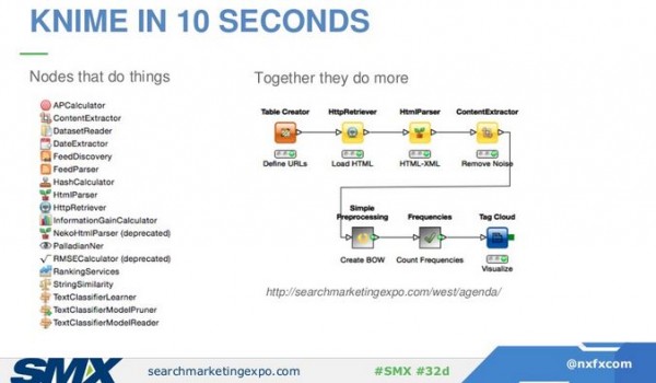
Comes with thousands of plug-ins for Google Analytics, Twitter, and WordPress.
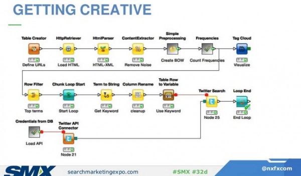
He loaded the URL of today’s session, put it through an algo, and turned out a word cloud of the key concepts. Then it processed the data against Twitter to see who’s tweeting about it and how often. A further node shows the Twitter users’ data. A step further, run the Twitter users against all social APIs and now you’re seeing a full online social picture of these people. From one URL, the tool runs through 10 other APIs. Twitter and social is one platform it worked for, and they also use it to extend Google Trends — to find out where people are talking about trends (cities) — seeing what states talk about what beauty product the most, for example.
- IMDB: everything
- Data.gov: Run media numbers against the population.
- Wikipedia: Wikipedia gives you raw data on everything including hourly page views, location specific, device segments, change history, article graph.
- SNAP: They extract everything that’s extractable, like 34 million Amazon reviews; extend the voice of the consumer and what they are talking about; linguistic or network analysis.
- Social Mention API: This is a near real-time API you can use for free.
- Common Crawl Corpus: It’s 541 TB, the entire Internet. It’s hard to handle in terms of size, but you can use it if you’re trying to understand your link graph.
Jenny Halasz: How to Create Awesome Google Analytics Dashboards & Reports
She’s going to look at GA dashboards. They’re free and awesome. Go back and implement immediately and see a benefit.
“Not everything that can be counted counts, and not everything that counts can be counted.” –Albert Einstein
http://bit.ly/GADashSMX15 a template dashboard she created. Plug and play, make adjustments based on your needs, then have a pretty report. Log in to GA, paste the link into your address bar, and GA will ask you which account the dashboard will be added to. It’s private until you share it.
Pros: It’s customizable, applicable to any GA segment, set up auto-emails, printable reports, set it up once, FREE.
Cons: It’s not user-friendly, relies on you to know what you need, requires you to set up segments, only holds 12 widgets per dashboard, can’t filter by metric values.
Where to start?
How did people get to your site? -> What did they do while they were there? -> How and why did they leave?
Know these three things and you’ll have a good idea of what’s happening on your website.
Here are the kinds of widgets you’d put on a dashboard to tell you how people got to your site:

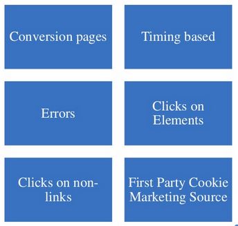
These widgets show you what they did on your site:
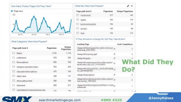
And here we see why people left the site:

Adding filters to your widget, she tends to tell people to stay away from Real-Time statistics because you could spend forever looking at it and have nothing to show for it.
When you use filters, there are two ways (only show / don’t show) and Regex, which is more powerful. Test your expressions on the actual report.
You can set up regular emails of dashboards (daily, weekly, monthly, quarterly, once).
You may want to set up a custom report. When she looks at sites, she expects areas of the site to perform differently (category vs. product, for example), and a custom report takes customizations and applies them to the dashboard. To decide what your custom reports may be, ask questions to determine importance.
Custom report setup can be challenging because GA isn’t very user-friendly. Think of metrics as things you want to measure and dimensions as containers you want to put those metrics in. Filters are things you want to include or not include.
Remember that data is just data and analysis is what leads to insight.
Steve Hammer: Analytics Toolbox: Google Tag Manager
Designers create innovative experiences beyond the page. The collection of that data is the key to the analysis. If your input is garbage, your output will be too. Get it right up front.
The problem we have is missing data. An input error on your site can be hard to capture, and so how do you know that it existed? Actions on infinite scroll are hard to capture. AJAX is hard to capture. How do you track that and what do you do about it? Google Tag Manager opens up capabilities for capturing this data. It gets sold as something easy, everyone can do it, don’t need to talk to IT. But if you do talk to IT, then you can do powerful things.
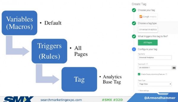
The essential: Variables (macros) is data to use, triggers (rules) is when to fire, and tag is what is fired. A tag is anything you want to happen and that can include a lot of things including HTML and JavaScript.
More interesting uses are in this set of enhanced examples. Conditional firing, AJAX, infinite scroll, and loading code.
He gives examples of an event of a form filled out, triggered when a certain URL comes up. This breaks the myth that you need a thank-you page to get a form filled out.
Another problem Tag Manager solves is getting to the original source. We want to credit an affiliate that introduced the visitor to the channel, not the last that siphoned off the traffic. If the affiliate is the source in the first-party cookie, then you can create and input that marketing source.
Another example is using custom formulas to read form elements and set user value. A shopper for a Bentley has a different value than someone shopping for a Ford.
Infinite scroll is handled with his “theoretical no code method.” If pushstate updates URL, build regex for pagination changes, then create a history change trigger. On this, watch out for back buttons.
Another approach is to piggyback off of “loading” HTML method. The look for a “loading” in the code and then a little script shows when the user scrolled on the page.
Q&A
What do you consider the most underused GA feature?
Spiegel: Custom variables to understand your audience and enabling retargeting.
Hammer: Advanced e-commerce for tracking through the cart process.
Halasz: Tracking schema activity through Tag Manager.
To understand setting up custom variables, look to Annie Cushing of Annielytics.
Bonus tip: Check out cohort analysis in beta in GA, especially if you’re a content-driven business. See if you’ve got a sticky experience on your site. For example, set up a segment to see if people originally reached via email came back.


LEAVE A REPLY

Contact Us Now.


