4 Thank You Page Examples That Got It Right
Sometimes the best epiphanies come from looking at the work of others. To help inspire your a-ha moment this case study highlights the best parts of four stellar thank you page examples that got it right.
ClickZ Email Newsletter Thank You Page
What They Did Right
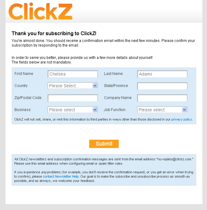
The star of the ClickZ thank you page is that prominent “help us get to know you better” form front and center. There are two noteworthy opportunities that come from having a voluntary form like this on your thank you page:
1. Demographic information helps to improve content marketing strategy
By collecting information that can’t be found in Google Analytics – like industry and job title – this form is a great small-scale research tool that will help you get a better idea of who your newsletter subscriber audience is, and, accordingly, what targeted content would resonate better with them.
2. Demographic collection forms help fill gaps in persona research
One line item you often find included in persona research is a detail about how a persona prefers to receive communications (email, social media, direct mail, phone call, etc.). Having a detailed picture of the people that take an interest in your email newsletter means you can start to draw lines between communication preferences (in this case email) and demographic characteristics — like industry and job title.
For example, say you find that the overwhelming majority of your newsletter subscribers are B2B CEOs. With this data you can refer to your persona profiles and, if you see a persona that centralizes, or otherwise includes, the B2B CEO role, you can add a line that says “Dan (or whatever you’ve name him or her), the B2B CEO, tends to show a great interest in staying connected to us via email.”
Note: This demographic collection form should be considered a supplemental tool, and should not take the place of finding out user preferences by actually having conversations with them.
NatureBox Facebook Giveaway Thank You Page
What They Did Right
There are three things that make this NatureBox thank you page a win:
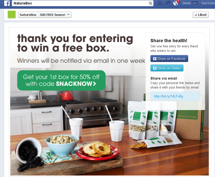
1. Coupon code pushes interested parties down the conversion funnel
The people who see this thank you page are folks who just expressed interest in winning a mass supply of the product. In other words, people who are interested in having the product. The coupon code call to action acknowledges the audience is in the earliest interest phase of the buying cycle, and attempts to push them further down the funnel by breaking down a price barrier.
2. A Social sharing call to action can turn one lead into 100
The only thing better than one interested lead is 100 interested leads. The Twitter and Facebook social sharing call to action seen here uses the end of the registration process (the thank you page) as an opportunity to inspire the motivated to motivate. It’s smart. The person seeing the thank you page wanted what you are offering, so there is a good chance their friends will also want it. And, by incentivizing the motivator with free entries into the contest you push them over the that’s-too-much-effort what’s-in-it-for-me Internet ADD hurdle of inactive laziness.
3. Personality in the design takes your relationship to the next level
Reflecting back on the lessons learned in how to make a thank you page 101, we know that the thank you page is the place to nurture relationships, make an impact, and inspire potential leads to take next steps.
The NatureBox thank you page does a great job keeping the lead engaged. It includes a personality-rich product image that specifically reflects the lifestyle of their target demographic. (See the kiddie cups with straws? And the stainless-steel appliance kitchen? I already know two things about their target market just by looking at this image.)
The trick is to use the thank you page imagery and messaging to take your relationship to the next level; to show them who you are, show them you understand who they are, and show them why you two are a match made in heaven. NatureBox does this perfectly here.
HubSpot Webinar Registration Thank You Page
What They Did Right
1. Keep user behavior in mind to create a conversion-focused design
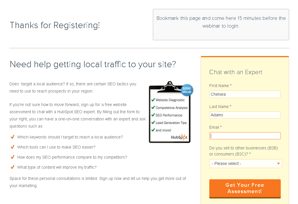
A recent web behavior study of 25 million user sessions shows that only 20% of people view the very top of a web page, while just over 80% of people view the area on a web page slightly above the fold. Looking at HubSpot’s thank you page, we can see they’ve wisely used the top 20% to house the requisite (yet conversion useless) thank you page text, and the slightly above the fold area to house the secondary (conversion influential) follow-up call to action.
This layout is smart because it doesn’t play down the importance of the thank you message and next step directions, but it does place the brand’s most important page element (the follow-up call to action) in the part of the page that gets the most visibility.
2. Use headlines, color, and images to guide their eye
Other design elements worth noting on this page are the prominent color used to draw the eye toward the conversion form, the benefit-rich image (that also draws the eye toward the conversion form), and the highly-targeted headline that draws the viewer in with a question.
Let’s just say if their goal was to funnel people towards that conversion form, design wise, they did a good job.
3. Catch their attention with questions and get them visualizing your solution solving their problem
In this example HubSpot draws their lead into the thank you page experience with a question that is directly related to the webinar topic. By leading with a question, and including several additional questions in the call to action text, they get the reader to start thinking about themselves, their situation, and how HubSpot may be able to help them accomplish their goals.
It’s a smart way to pique the lead’s interest and shift their focus from a webinar next week, to the possibility of a solution right now.
Orbit Media Studios Contact Form Thank You Page
What They Did Right
1. Catch ’em quick by keeping it simple
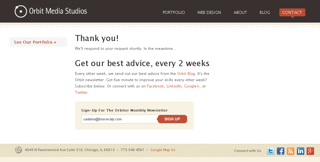
Sometimes less is more. The Orbit Media Studios page is the perfect example of a low-tech thank you page that converts.The uncluttered page delivers its primary call to action with only seven words (“get our best advice every 2 weeks”) and a prominently colored newsletter opt-in form.
The uncluttered design doesn’t take any decoding and makes it easy to catch skimmers and scanners who have places to be.
2. Give them options without making your page look like a link farm
Believe it or not, this thank you page – the page that is being praised for its simplicity and uncluttered appearance – has six calls to action, and is the first example we’ve discussed that has more than three.The takeaway here is that having several calls to action on your thank you page doesn’t mean your page has to look like a link farm. Using a finer font treatment for their secondary calls to action, Orbit Media has done an excellent job offering several calls to action on one page without watering down the primary call to action, or making the lead feel overwhelmed by options.
What do these thank you page examples all have in common?
There is not a one-size-fits-all model for thank you pages, however, there are some key ingredients that can help transform ho-hum thank you pages into personality-rich conversion tools. Here are four of those ingredients – all of which can be seen in each of the four thank you page examples dissected in this blog post:
- Always make sure to set goals and create calls to action that help you accomplish those goals.
- The data you collect with thank you page forms can help influence your persona research and content strategy.
- Take into consideration your lead’s arrival path, what mindset they’re in, and what their first step tells you about their interests, preferences, and needs.
- Personality and design matter, and everything you put above the fold on your thank you page will be far more successful if the design of your page takes into consideration user experience and reflects your brand personality.
Want to see more Thank You Page tips?
Check out the following resources to find a two-part how-to series and even more examples:
26,000+ professionals, marketers and SEOs read the Bruce Clay Blog
Subscribe now for free to get:
- Expert SEO insights from the "Father of SEO."
- Proven SEO strategies to optimize website performance.
- SEO advice to earn more website traffic, higher search ranking and increased revenue.
9 Replies to “4 Thank You Page Examples That Got It Right”
Indeed a good article on a not so common topic. I did a similar post with a case study that shows the three thank you pages from the same site and how the user engagement changed (Google analytics metrics) with the change in design. This might be a good follow up reading to this post.
Four excellent examples Chelsea, and you’ve drawn some solid conclusions.
The social sharing call to action on the Thank You page is a great idea. I was watching a video by Paul Boag earlier this week, and he recommended leaving social media buttons off the site until the visitor has taken some form of desired action; then asking them to take another. Makes sense.
– Cole
Hi, Cole!
Glad the article resonated with you.
I think having social share calls to action in the right place at the right time (i.e., on a thank you page) is an excellent way to capitalize on opportunity. But I don’t really see any reason to withhold the social share buttons until the moment is perfect, though. I think in an everyday situation social sharing should be a secondary or tertiary read/priority on the page, and they should be bumped up to the star of the show only if you want to make them a post-action call to action (like NatureBox did in the thank you page example I mention).
I am curious what Paul said about leaving social share buttons off the site. I can only think of two reasons why I would consider leaving them off:
1) If they are adding load time to the web page, which can result in a poor user experience (and abandons) and a SERP rank decrease if Google deems the sluggishness to be a low site quality indicator.
2) If the social share buttons have number flags associated with them and you don’t want to shoot yourself in the foot by displaying single-digit social engagement flags on pages that don’t get herds of traffic.
If those are your concerns, ok; I can meet you in the middle. Otherwise, how can offering visitors buttons that help them spread your content and/or connect with you socially be a bad thing?
Good conversation topic, Cole. I like it.
LEAVE A REPLY
