Why Yahoo!’s “30 Days of Change” Reminds Me of OJ Simpson, and 4 Ways They Could Have Done It Better
Looking at the 17 logos that have come out of Yahoo!’s “30 Days of Change” and the commentary surrounding the campaign, I can’t help but think of two things: OJ Simpson’s BitTorrent-leaked book If I Did It and Rebecca Black’s song Friday.
I think of the former — a book telling a hypothetical back-story of real events — because, to me, this 30 Days of Change campaign is little more than a rebranding dog and pony show that offers 30 days of hypothetical back-story poorly executed to accompany a real story (the new logo being launched September 4 at 9 p.m. PST). There are two main differences between OJ’s book and Yahoo!’s campaign (besides the murder and all that; although I do think this campaign might be considered by some a brand identity murder): one, OJ’s book actually tells a story. It’s not a terribly heartwarming or ethical story, but it has a beginning, middle, and end, and we leave the experience knowing more than when we arrived. Yahoo!’s hypothetical back story shows us many drafts of a story, but it doesn’t tell a story itself. The logos don’t help us better understand the evolution and innovation of Yahoo! or the experiences the brand has seen over the past year. We don’t leave the experience knowing more than when we arrived. There’s no experience. It just….is.
The second main difference is that, with an inkling of chance that the hypothetical storyline of If I Did It may actually be true, it feels sadly like the book has a purpose that makes it more engaging than the “content just for the sake of content” offering Yahoo! has offered us.
Rebecca Black’s “hit song” Friday comes to mind because — like the YouTube sensation that garnered over 58 million views for “all the wrong reasons,” as CNN politely put it — if you perform a Twitter search for “Yahoo Logo” or scan the comments on fb.com/Yahoo you will see lots of people are actually talking about the 30 Days of Change campaign; they’re just not talking nicely about it. The main difference here is that Rebecca Black’s music video bomb took a risk and turned out to be so bad it actually earned enough attention to come full circle and end up a finagled pop culture iteration of “good.” Unfortunately for Yahoo!, in spite of being a campaign rooted in showcasing a “spirit of innovative” I feel like the 30 days of logos didn’t push the envelope enough to really do anything other than make the actual logo reveal little more than a 31st font treatment.
So, where do we stand?
On the positive side, like Rebecca Black and OJ Simpson, Yahoo! has created a campaign that people are talking about. (Is any PR good PR? An oldie but goodie conversation worth discussing in the comments.) Unfortunately, on the realistic side, Yahoo! has created a campaign that brings to mind Rebecca Black and OJ Simpson. Two great costumes if you need to phone it in at a Halloween party, but also two names you never want to end a sentence that starts “Your marketing reminds me of….”
Four Ways Yahoo! Could Have Done It Better
There are four elements that every winning marketing campaign has to have in one form or another: focused goals, an element of storytelling, a visually accessible and compelling design, and community engagement.
I feel like a campaign in the same vein as this one could have accomplished all four of these critical success factors, but I feel like this campaign completely missed the mark on all levels. Here are four ways Yahoo! could have done it better.
1) Focus the Project and the Project Goals
The Community Says:
I think I can safely say that is not what Yahoo! was going for…
As with any project, Yahoo! should have started on a better campaign path by seriously asking themselves “what is it I want to accomplish with this campaign?” and then asking themselves if their proposed campaign model, as outlined, accomplishes this goal.
I have to assume they skipped over this very critical first step, otherwise there’s no way I can piece together how the beautiful new products, artist partnerships, and product expansions outlined in the Tumbler kickoff of this project could be so absent from the actual campaign execution itself.
The kickoff is all about storytelling and showcasing the evolution of a brand, but the execution is all about…well. I’m not sure what the execution is all about. It appears to be all about pumping out a mass amount of daily content that was created with a very limited creative budget.
What They Should Have Done
Made the scope of the project smaller and more focused on using this campaign to visually and verbally convey the brand goals they outline in the kickoff press release.
2) Tell Your Brand Story and Showcase Product Innovation
The Community says:
Many of the comments I see in the community express detest for such a lavish logo display when they feel like it’s the products and services of Yahoo! that need a refresh. It’s a shame, really, because the 30 Days of Change press release emphasis is all about how Yahoo! has been reimagining its products and services over the years, and the September logo change is simply a branding effort to physically evolve the brand’s “essence” to match the evolution of its products and services. In other words, this campaign was all about showcasing the progress in products and services Yahoo! has made and giving the evolved company a brand identity to match. Unfortunately, there is a major disconnect between Yahoo!’s intentions and what they actually deliver, and it’s largely because of Yahoo!’s lack of storytelling. People are grasping for a “why” in all of this, and since the logos don’t help tell the Yahoo! story they seem like a frivolous use of time.
What They Should Have Done
A great solution would have been to create logos that, in their design, reflect the “beautiful new products” that are referenced in the press release. For instance, the press release mentions Yahoo! has “changed the way you see weather.” I would have loved a weather-themed logo accompanied by a sentence or two that explains the role Yahoo! plays in delivering weather reports, and specifically how the brand has “changed the way [I] see weather.” Or, since this campaign is meant to honor the legacy of the present logo, this could have been a great opportunity to use design to tell the story of Yahoo!’s evolution starting with where it came from, and ending with where it’s going.
Not only would this direction help give a much-needed sense of purpose to Yahoo!’s daily logos, the brand storyline element would help keep people engaged and personally invested in the campaign; an element that is critical to the success of any multi-day initiative.
3) Get Creative, Surprise Us, and Keep Us Visually Engaged
The Community Says:
The big talk of the town in Yahoo! Facebook comments and on Twitter has been the lackluster effort put into the design of each day’s logo.
If the essence of the campaign was to showcase Yahoo!’s spirit of innovation, I can’t help but wonder why Yahoo! took such a less-than-innovative route in their execution. If anything Yahoo!’s half-hearted typographic parade makes the brand feel out of touch and locked in the ’90s more than progressive or evolving.
What They Should Have Done
If you’re going to run a multi-day campaign that is contingent on a design element – like Yahoo!’s 30 days of logos is – it is critical that you are motivated to make every day purposeful, engaging, and surprising. If day six of your 30-day campaign doesn’t have enough creative staying power to get your community interested and talking, it shouldn’t be included. Each day needs to be treated with the same strategic attention as you would treat a one-day campaign. Just creating content for the sake of creating content and throwing things to the public haphazardly is never a strategy that works, and it always does more harm than good for your brand reputation.
If day after day the design is expected, bland, or — as we’ve seen with Yahoo!’s execution — simply nothing to write home about, what should be excitement to see the day’s design revealed can easily turn into disengaged annoyance.
More focus on creating “wow factor” designs that convey Yahoo’s new-found progressive attitude would have gone far in this campaign.
4) Engage and Involve the Community
The Community Says:
The press release is all about how Yahoo! has changed the way “you” – meaning, we, the consumer – interact with the Internet, from sharing photos to following a favorite sports team. The problem is, I don’t see any me represented in this campaign. This campaign is supposed to get us – the Yahoo! users – excited about the new logo. But without any elements that physically engage visitors, we all become passive observers to what almost feels like one-sided bullhorn marketing.
What They Should Have Done
You know a great way to get people excited about a monotonous design procession? Get them involved! Ask for their opinion, ask them to vote, or even ask them to contribute their own designs for consideration.
That’s what design community 99designs, and poll application Polar did.
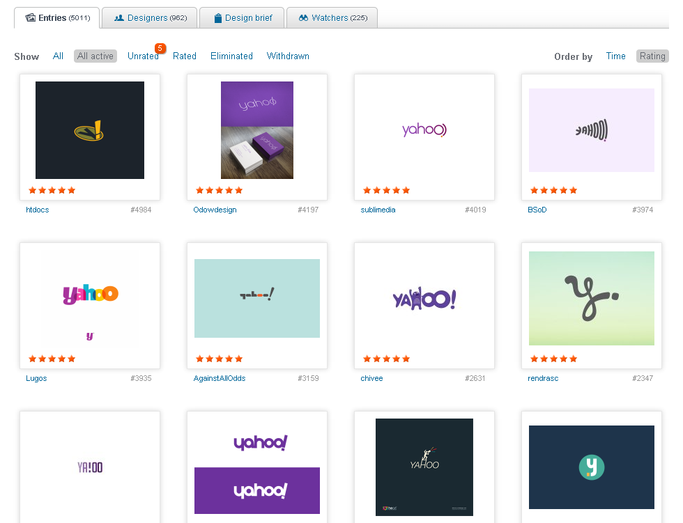
99designs challenged users to “jump right into the rebranding-fest” and submit their own Yahoo! logo designs (without restriction) for a chance at a cash prize and some street-cred. The competition saw 5,000+ entries in the seven days it was open, and, as one tweeter put it “many [designs that] are better than the ones Yahoo! has shown so far.” In addition to soliciting designs, 99designs also allowed community members to vote on their favorite designs using a five-star scale.
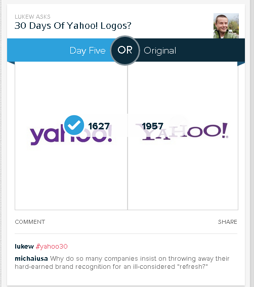
Opinion application provider Polar jumped on Yahoo!’s missed opportunity by making a page that allows users to vote for their preference in several ‘this versus that’ match-ups, including the new logo versus the classic style, and various days against each other (e.g., day three against day 16, etc.). On most of the Yahoo! grudge-match polls engagement numbers reach nearly 4,000 votes.
Both examples offer fun and interesting tactics Yahoo! could have applied to turn a passive promotion into an active, memorable initative.
Yahoo! Sure Fell Off The Balance Beam This Time…
When you write this many words on a topic you spend a lot of time thinking about it, and I really do think that Chief Marketing Officer, Kathy Savitt, had the right idea wanting to “get everyone warmed up” and avoid a Gap-esque backlash to sudden change. I think Yahoo! is truly passionate about bursting out of its 12-year cocoon and reemerging a progressive, innovative, social butterfly that is hip enough to hang out with Imagine Dragons and compete with Google for your search time.
Regrettably, as any bronze-metal Olympic gymnast will tell you, sometimes it just doesn’t matter how good your intentions are, or how badly you want something to go right, at the end of the day it’s all about how well you execute.
And Yahoo! really fell off the balance beam on this one.
26,000+ professionals, marketers and SEOs read the Bruce Clay Blog
Subscribe now for free to get:
- Expert SEO insights from the "Father of SEO."
- Proven SEO strategies to optimize website performance.
- SEO advice to earn more website traffic, higher search ranking and increased revenue.

5 Replies to “Why Yahoo!’s “30 Days of Change” Reminds Me of OJ Simpson, and 4 Ways They Could Have Done It Better”
Absolutely brilliant article, Chelsea!
Yahoo made so many key mistakes that they really do appear to be desperate.
Hi, Chris!
So many mistakes indeed! And key, small business “this is my first marketing campaign” mistakes… It’s shocking how many proverbial balls were dropped in the making of this campaign, actually. That said, I’m keeping my fingers crossed that I’m not the only one reading the feedback and Yahoo! is able to learn a lesson from all this rigmarole.
Thanks for reading the article. Glad you liked it!
That is sad. I do agree. They could’ve done it better. This only goes to show that it isn’t given that if the campaign is done by a huge, popular company, it is going to be successful.
In a way it was, if we are only talking about being hyped up and get people to know about your campaign. But on getting them to feel positive about it, it didn’t work out.
I’ve initially read this article on the IM social networking site, Kingged.com, where it has been shared.
Thanks for the comment, Riza. And thanks for the article syndication.
As I said in my comment over on Kingged, I agree — this is sad. I am really hoping this is just a one-time flop, and not a preview of what’s to come. Yahoo! has been an iconic player in the search industry for over a decade and it would be a shame to watch the brand crumble under the weight of poorly conceived marketing and PR.
Hi Chelsea,
You have done a very good job with this article. Particularly, I am impressed with your comparison on the OJ Simpson’s book. There is a lot that Yahoo needs to learn on the 30 Days of Change, and I suggest they should learn from the 4 ideas highlighted in this post.
I have left this comment in kingged.com where this post was shared and kingged.
Sunday – kingged.com contributor
LEAVE A REPLY


