
 --%3E%3Csvg version='1.1' id='_x3C_Layer_x3E_' xmlns='http://www.w3.org/2000/svg' xmlns:xlink='http://www.w3.org/1999/xlink' x='0px' y='0px' viewBox='0 0 234.24 234.24' style='enable-background:new 0 0 234.24 234.24;' xml:space='preserve'%3E%3Crect x='0.029' y='0.008' style='fill:%231972B9;' width='234.24' height='234.24'/%3E%3Cg%3E%3Cg%3E%3Cpath style='fill:%23FFFFFF;' d='M24.3,63.466l-0.268-0.235v-1.679l0.268-0.235c3.828,0.179,6.782,0.269,8.865,0.269 c0.782,0,5.315-0.09,10.734-0.269c1.745-0.044,3.009-0.066,3.794-0.066c3.023,0,5.417,0.301,7.186,0.905 c1.769,0.605,3.189,1.673,4.264,3.208c1.074,1.533,1.612,3.274,1.612,5.221c0,2.485-0.895,4.791-2.686,6.916 c-1.791,2.128-4.7,3.65-8.729,4.568c2.417,0.223,4.41,0.549,5.977,0.972c1.566,0.425,2.921,1.08,4.061,1.966 c1.142,0.884,2.043,2.03,2.704,3.44c0.66,1.41,0.991,3.045,0.991,4.904c0,1.454-0.225,2.933-0.672,4.433 c-0.448,1.498-1.27,2.987-2.468,4.466c-1.198,1.476-2.646,2.742-4.348,3.793c-1.701,1.052-3.441,1.815-5.222,2.283 c-1.78,0.47-3.99,0.705-6.631,0.705c-0.537,0-3.582-0.056-6.268-0.168c-2.979-0.067-4.59-0.099-4.835-0.099 c-1.523,0-3.393,0.088-5.608,0.267l-0.269-0.267v-1.109l0.269-0.334c1.298-0.583,2.048-0.986,2.249-1.21 c0.201-0.222,0.365-2.205,0.488-5.942c0.123-3.74,0.185-6.594,0.185-8.564V79.281l-0.034-7.622c0-1.657-0.022-3.006-0.067-4.046 c-0.045-1.042-0.106-1.785-0.185-2.234c-0.077-0.446-0.206-0.761-0.385-0.94s-0.431-0.329-0.756-0.453 c-0.324-0.123-0.878-0.229-1.662-0.32L24.3,63.466z M36.355,81.095c1.119,0.09,2.384,0.135,3.795,0.135 c4.633,0,9.289-0.828,11.103-2.486c1.813-1.656,2.719-3.929,2.719-6.815c0-1.679-0.347-3.106-1.042-4.283 c-0.693-1.174-1.785-2.076-3.274-2.702c-1.488-0.628-4.941-0.942-7.493-0.942c-2.081,0-3.918,0.169-5.507,0.504 c-0.202,2.015-0.302,5.529-0.302,10.543V81.095z M36.422,105.573c1.724,0.403,3.493,0.604,5.305,0.604 c3.2,0,7.142-0.515,8.954-1.543c1.814-1.031,3.15-2.458,4.013-4.283c0.861-1.825,1.293-3.811,1.293-5.96 c0-3.223-0.911-5.802-2.736-7.739c-1.824-1.937-7.202-2.904-13.27-2.904c-1.007,0-2.216,0.044-3.626,0.133v11.452L36.422,105.573z '/%3E%3Cpath style='fill:%23FFFFFF;' d='M68.331,108.914v-1.589l0.44-0.325l0.108-0.004c1.568-0.066,2.622-0.15,3.133-0.246 c0.632-0.119,0.837-0.253,0.895-0.307c0.055-0.048,0.197-0.225,0.324-0.827c0.106-0.491,0.168-1.636,0.185-3.404l0.026-5.311 v-11.66l-0.052-4.907c-0.015-1.887-0.063-3.117-0.137-3.656c-0.09-0.655-0.223-0.862-0.274-0.921 c-0.063-0.071-0.248-0.213-0.757-0.342c-0.299-0.078-1.123-0.185-3.342-0.267l-0.125-0.004l-0.425-0.366V73.19l0.439-0.375 l0.14,0.006c3.115,0.133,5.572,0.202,7.305,0.202c1.922,0,4.555-0.06,7.822-0.176c1.224-0.035,2.109-0.05,2.659-0.05 c4.473,0,7.438,0.792,9.065,2.421c1.604,1.608,2.417,3.54,2.417,5.744c0,1.464-0.395,2.921-1.177,4.327 c-0.778,1.406-1.941,2.622-3.455,3.615c-1.397,0.915-3.3,1.627-5.661,2.121c0.506,0.674,1.256,1.654,2.254,2.938l3.649,4.736 c1.182,1.562,2.449,3.208,3.799,4.946c1.728,2.22,2.318,2.742,2.516,2.857c0.357,0.204,0.659,0.33,0.9,0.374 c0.259,0.046,0.693,0.068,1.285,0.068h0.146l0.418,0.41v1.484l-0.463,0.453l-0.171-0.021c-0.804-0.099-1.775-0.15-2.885-0.15 c-1.203,0-2.533,0.05-3.956,0.151l-0.183,0.013l-0.116-0.14c-1.181-1.406-3.06-3.88-5.59-7.347 c-2.921-3.999-5.957-7.76-9.019-11.179l-0.139-0.155l0.409-1.238l0.275,0.017c0.881,0.048,1.568,0.074,2.06,0.074 c2.863,0,5.129-0.676,6.732-2.009c1.608-1.333,2.388-3.138,2.388-5.516c0-2.118-0.693-3.666-2.118-4.738 c-1.437-1.081-3.421-1.629-5.898-1.629c-1.695,0-3.317,0.225-4.823,0.667c-0.103,0.409-0.29,2.149-0.29,9.15v11.661l0.025,4.908 c0.016,1.868,0.068,3.086,0.149,3.625c0.102,0.656,0.235,0.865,0.288,0.925c0.064,0.074,0.249,0.218,0.764,0.357 c0.298,0.081,1.117,0.196,3.335,0.278L83.739,107l0.44,0.325v1.589l-0.417,0.41h-0.148c-0.086,0-1.596-0.052-4.533-0.153 c-1.209-0.032-2.156-0.05-2.84-0.05c-0.525,0-2.991,0.067-7.336,0.203l-0.152,0.004L68.331,108.914z'/%3E%3Cpath style='fill:%23FFFFFF;' d='M123.441,110.053c-2.372,0-4.505-0.267-6.332-0.795c-1.844-0.532-3.322-1.249-4.397-2.132 c-1.078-0.887-1.864-1.838-2.337-2.829c-0.468-0.982-0.776-2.148-0.914-3.467c-0.136-1.29-0.204-3.282-0.204-5.917v-9.671 l-0.052-4.909c-0.015-1.89-0.061-3.12-0.134-3.656c-0.089-0.655-0.218-0.864-0.268-0.923c-0.063-0.072-0.241-0.212-0.738-0.341 c-0.294-0.075-1.1-0.183-3.274-0.264l-0.127-0.006l-0.418-0.367v-1.584l0.43-0.376l0.141,0.005c4.141,0.133,6.56,0.2,7.192,0.2 c0.564,0,2.991-0.067,7.217-0.2l0.141-0.005l0.43,0.376v1.584l-0.42,0.368l-0.129,0.005c-1.145,0.033-2.038,0.083-2.655,0.148 c-0.711,0.075-1.054,0.217-1.216,0.323c-0.109,0.071-0.305,0.298-0.407,1.044c-0.089,0.66-0.134,1.598-0.134,2.785l-0.05,5.795 v8.004c0,2.615,0.055,4.556,0.162,5.773c0.106,1.192,0.334,2.205,0.678,3.015c0.337,0.791,0.858,1.483,1.55,2.055 c0.694,0.579,1.719,1.061,3.04,1.43c1.34,0.376,2.882,0.565,4.588,0.565c1.802,0,3.506-0.252,5.065-0.75 c1.533-0.49,2.711-1.203,3.503-2.121c0.791-0.921,1.319-2.152,1.567-3.666c0.257-1.559,0.385-3.764,0.385-6.552v-7.757 c0-1.308-0.022-3.107-0.063-5.396c-0.056-3.035-0.206-3.675-0.269-3.811c-0.12-0.261-0.348-0.457-0.692-0.6 c-0.265-0.107-1.074-0.246-3.434-0.286l-0.145-0.003l-0.408-0.408v-1.469l0.407-0.458l0.172,0.01c2.467,0.133,4.468,0.2,5.95,0.2 c1.264,0,3.257-0.067,5.924-0.2l0.147-0.008l0.456,0.406v1.53l-0.446,0.397l-0.132,0.003c-1.55,0.033-2.569,0.095-3.024,0.182 c-0.507,0.099-0.731,0.229-0.828,0.322c-0.141,0.136-0.25,0.366-0.327,0.681c-0.059,0.248-0.137,1.012-0.179,3.248l-0.076,5.665 v7.65c0,3.059-0.119,5.507-0.355,7.277c-0.242,1.812-0.794,3.328-1.638,4.507c-0.835,1.161-1.84,2.146-2.986,2.93 c-1.148,0.786-2.633,1.398-4.414,1.817C127.199,109.843,125.341,110.053,123.441,110.053'/%3E%3Cpath style='fill:%23FFFFFF;' d='M166.203,110.053c-6.125,0-11.175-1.767-15.012-5.255c-3.845-3.496-5.795-8.126-5.795-13.763 c0-3.881,0.972-7.326,2.893-10.234c1.917-2.905,4.483-5.109,7.629-6.551c3.129-1.434,6.693-2.16,10.588-2.16 c2.248,0,4.502,0.239,6.699,0.713c2.197,0.473,4.059,1.049,5.535,1.711l0.09,0.041l0.347,0.493l-0.075,0.182 c-0.371,0.903-0.726,3.215-1.057,6.871l-0.012,0.116l-0.36,0.411h-1.494l-0.402-0.402l-0.251-4.255 c-1.162-0.895-2.576-1.609-4.204-2.12c-1.694-0.532-3.485-0.802-5.321-0.802c-2.763,0-5.274,0.6-7.46,1.784 c-2.176,1.177-3.89,2.908-5.093,5.143c-1.208,2.245-1.821,5.038-1.821,8.304c0,3.28,0.722,6.194,2.143,8.66 c1.42,2.465,3.386,4.386,5.841,5.707c2.462,1.325,5.382,1.997,8.682,1.997c1.463,0,2.887-0.14,4.234-0.42 c1.344-0.28,2.476-0.625,3.361-1.033c0.89-0.408,1.755-0.915,2.572-1.501l0.275-0.197l0.775,0.954l-1.089,2.662l-0.119,0.06 C174.543,109.084,170.471,110.053,166.203,110.053'/%3E%3Cpath style='fill:%23FFFFFF;' d='M184.053,108.912v-1.104l0.328-0.411l0.069-0.035c1.341-0.681,1.583-0.856,1.626-0.893 c-0.012-0.042,0.118-0.694,0.23-4.151c0.092-2.794,0.139-4.956,0.139-6.423v-9.242l-0.026-5.715c0-1.238-0.016-2.245-0.05-3.021 c-0.032-0.752-0.087-1.293-0.167-1.603c-0.092-0.371-0.178-0.514-0.219-0.566c-0.048-0.057-0.15-0.145-0.378-0.231 c-0.148-0.056-0.469-0.139-1.161-0.218l-2.019-0.16l-0.413-0.361v-1.585l0.428-0.374l0.138,0.003 c5.731,0.099,9.447,0.15,11.05,0.15c5.477,0,10.423-0.052,14.698-0.15l0.19-0.004l0.333,0.466l-0.042,0.163 c-0.411,1.582-0.722,4.107-0.922,7.51l-0.006,0.109l-0.323,0.43h-1.549l-0.467-0.414l0.021-0.185 c0.014-0.136,0.022-0.256,0.022-0.364c0-1.329-0.098-2.616-0.291-3.827c-1.003-0.41-2.38-0.684-4.101-0.814 c-1.854-0.142-3.264-0.213-4.19-0.213c-1.241,0-2.833,0.082-4.738,0.247l-0.091,3.709l-0.146,9.373 c1.669,0.087,3.231,0.132,4.649,0.132c1.524,0,2.818-0.05,3.844-0.148c1.379-0.134,1.636-0.243,1.673-0.263 c0.094-0.059,0.18-0.207,0.245-0.428c0.086-0.286,0.162-0.817,0.227-1.577l0.108-1.689l0.403-0.401h1.454l0.414,0.414 l-0.003,0.152c-0.034,1.831-0.076,3.67-0.126,5.519l0.129,5.801l-0.414,0.416h-1.454l-0.396-0.396l-0.19-1.634 c-0.183-1.428-0.272-1.9-0.315-2.043c-0.043-0.147-0.15-0.277-0.325-0.399c-0.087-0.059-0.429-0.211-1.71-0.34 c-0.99-0.101-2.376-0.15-4.119-0.15c-0.916,0-2.289,0.038-4.118,0.111c-0.071,1.427-0.107,3.68-0.107,6.709 c0,3.271,0.036,5.766,0.108,7.422h4.293c4.049,0,6.613-0.05,7.621-0.148c0.93-0.092,1.829-0.309,2.674-0.646 c0.148-0.429,0.376-1.268,0.679-2.496c0.337-1.384,0.536-2.255,0.583-2.595l0.022-0.155l0.471-0.33h1.457l0.46,0.403l-0.043,0.206 c-0.145,0.704-0.291,1.96-0.434,3.734c-0.143,1.777-0.213,3.319-0.213,4.578v0.134l-0.376,0.431l-0.169-0.006 c-3.189-0.099-7.421-0.15-12.581-0.15l-6.852-0.052c-1.575,0-3.244,0.067-4.956,0.201l-0.165,0.011L184.053,108.912z'/%3E%3C/g%3E%3Cg%3E%3Cpath style='fill:%23FFFFFF;' d='M89.628,166.088l-1.251,3.124c-4.869,2.528-10.068,3.793-15.597,3.793 c-7.92,0-14.352-2.293-19.299-6.883c-4.947-4.589-7.421-10.587-7.421-17.997c0-5.105,1.234-9.564,3.702-13.381 c2.468-3.817,5.725-6.671,9.773-8.562c4.048-1.892,8.595-2.838,13.64-2.838c2.919,0,5.804,0.314,8.655,0.939 c2.851,0.628,5.231,1.377,7.141,2.251l0.231,0.335c-0.505,1.254-0.978,4.354-1.416,9.301l-0.231,0.269H86.01l-0.264-0.269 l-0.329-5.708c-1.603-1.298-3.538-2.311-5.809-3.039c-2.271-0.728-4.634-1.092-7.091-1.092c-3.708,0-7.032,0.811-9.97,2.434 c-2.941,1.623-5.221,3.974-6.847,7.052c-1.62,3.079-2.433,6.844-2.433,11.3c0,4.477,0.954,8.404,2.862,11.785 c1.909,3.382,4.515,5.977,7.815,7.79c3.3,1.813,7.157,2.72,11.567,2.72c1.952,0,3.828-0.189,5.627-0.571 c1.799-0.38,3.296-0.851,4.491-1.41c1.196-0.56,2.342-1.242,3.439-2.047L89.628,166.088z'/%3E%3Cpath style='fill:%23FFFFFF;' d='M93.747,171.912v-1.104l0.327-0.41l0.067-0.036c1.337-0.688,1.574-0.866,1.614-0.904 c-0.011-0.025,0.087-0.518,0.221-3.026c0.108-2.033,0.162-4.518,0.162-7.385v-10.804l-0.05-4.908 c-0.017-1.89-0.063-3.121-0.134-3.658c-0.09-0.655-0.218-0.863-0.269-0.921c-0.062-0.071-0.241-0.212-0.74-0.341 c-0.292-0.076-1.098-0.183-3.272-0.265l-0.127-0.006l-0.418-0.366v-1.585l0.431-0.375l0.14,0.004 c4.14,0.133,6.559,0.201,7.191,0.201c0.565,0,2.991-0.068,7.217-0.201l0.14-0.004l0.431,0.375v1.585l-0.42,0.368l-0.129,0.004 c-1.145,0.033-2.037,0.083-2.656,0.149c-0.711,0.075-1.052,0.216-1.217,0.323c-0.106,0.07-0.302,0.298-0.404,1.044 c-0.091,0.661-0.136,1.597-0.136,2.785l-0.05,5.794v11.129c0,2.783,0.017,4.726,0.05,5.831l0.115,4.01h4.791 c4.066,0,6.635-0.05,7.633-0.148c0.926-0.092,1.832-0.311,2.695-0.649c0.171-0.456,0.414-1.363,0.719-2.7 c0.442-1.949,0.523-2.444,0.532-2.565l0.011-0.147l0.436-0.388h1.534l0.4,0.457l-0.035,0.171c-0.13,0.655-0.267,1.953-0.41,3.862 c-0.143,1.911-0.213,3.478-0.213,4.656v0.148l-0.417,0.417l-0.154-0.006c-3.172-0.099-7.396-0.15-12.555-0.15l-7.357-0.052 c-1.659,0-3.377,0.067-5.107,0.201l-0.165,0.011L93.747,171.912z'/%3E%3Cpath style='fill:%23FFFFFF;' d='M160.736,172.322c-1.762-0.15-3.369-0.225-4.779-0.225c-2.777,0.085-5.566,0.159-8.353,0.227 l-0.153,0.004l-0.415-0.415v-1.606l0.408-0.409l0.144-0.003c2.296-0.041,3.138-0.146,3.441-0.227 c0.386-0.104,0.439-0.311,0.439-0.522c0-0.323-0.109-0.772-0.327-1.331l-3.005-7.453h-14.104l-2.651,6.229 c-0.466,1.107-0.702,1.915-0.702,2.402c0,0.185,0.053,0.423,0.467,0.604c0.28,0.126,1.076,0.277,3.284,0.297l0.133,0.003 l0.448,0.396v1.619l-0.42,0.423l-0.162-0.011c-2.148-0.133-4.055-0.2-5.669-0.2c-1.83,0-3.702,0.067-5.566,0.2l-0.151,0.011 l-0.459-0.409v-1.633l0.446-0.396l0.133-0.003c1.477-0.02,2.048-0.104,2.267-0.173c0.29-0.088,0.543-0.266,0.777-0.543 c0.176-0.207,0.6-0.919,1.623-3.13l2.646-5.74l6.847-15.509c1.291-3.035,2.574-6.072,3.85-9.11l0.092-0.219h2.113l12.28,28.876 c0.417,0.951,0.898,1.987,1.44,3.106c0.716,1.472,0.981,1.812,1.061,1.889c0.172,0.165,0.392,0.294,0.652,0.386 c0.187,0.066,0.68,0.148,1.964,0.168l0.145,0.003l0.409,0.409v1.606l-0.424,0.425L160.736,172.322z M146.857,157.478 l-5.787-13.902l-5.879,13.902H146.857z'/%3E%3Cpath style='fill:%23FFFFFF;' d='M166.505,171.912v-1.585l0.434-0.326l0.11-0.006c1.57-0.064,2.609-0.147,3.093-0.243 c0.572-0.115,0.778-0.241,0.849-0.307c0.067-0.06,0.196-0.236,0.307-0.742c0.095-0.435,0.151-1.364,0.168-2.76l0.051-4.307v-4.782 c-0.334-0.749-1.571-2.927-3.65-6.335l-2.215-3.6c-0.698-1.13-1.588-2.467-2.646-3.974c-1.047-1.491-1.864-2.515-2.43-3.04 c-0.677-0.629-1.035-0.824-1.216-0.875c-0.161-0.048-0.696-0.125-2.47-0.125h-0.148l-0.437-0.437v-1.354l0.413-0.412l7.385-1.227 l0.12,0.083c0.523,0.367,1.041,0.835,1.536,1.39c0.495,0.558,1.191,1.559,2.125,3.058c0.915,1.467,2.109,3.542,3.548,6.162 c1.336,2.431,2.639,4.899,3.878,7.342l2.229-3.545l2.892-4.828l5.454-9.338l0.231,0.025c0.638,0.064,1.271,0.099,1.876,0.099 c0.379,0,0.957-0.034,1.732-0.099l0.167-0.014l0.424,0.424v0.765l-0.094,0.102c-0.826,0.91-2.131,2.59-3.878,4.994 c-1.75,2.408-3.071,4.317-3.929,5.672c-0.863,1.367-1.924,3.086-3.182,5.157c-1.54,2.537-1.952,3.384-2.026,3.652 c-0.109,0.385-0.164,0.854-0.164,1.389v3.702l0.025,3.775c0.017,1.434,0.07,2.446,0.16,3.007c0.113,0.708,0.25,0.904,0.29,0.949 c0.063,0.07,0.241,0.204,0.732,0.334c0.287,0.077,1.086,0.183,3.26,0.264L181.62,170l0.435,0.326v1.585l-0.413,0.411h-0.148 c-0.084,0-1.566-0.05-4.445-0.15c-1.185-0.035-2.114-0.052-2.783-0.052c-0.53,0-2.951,0.068-7.191,0.201l-0.155,0.006 L166.505,171.912z'/%3E%3Cpath style='fill:%23FFFFFF;' d='M190.461,172.648c-0.73,0-1.434-0.193-2.089-0.568c-0.656-0.378-1.167-0.898-1.518-1.55 c-0.35-0.646-0.526-1.633-0.526-2.323c0-0.693,0.176-1.062,0.526-1.707c0.35-0.646,0.86-1.168,1.518-1.547 c0.653-0.379,1.359-0.571,2.089-0.571c0.729,0,1.422,0.186,2.06,0.554c0.638,0.365,1.147,0.877,1.517,1.519 c0.367,0.641,0.553,1.333,0.553,2.061c0,0.737-0.186,1.431-0.553,2.068c-0.367,0.636-0.877,1.146-1.511,1.511 C191.891,172.461,191.196,172.648,190.461,172.648 M190.461,165.157c-0.594,0-1.167,0.157-1.701,0.462 c-0.533,0.305-0.947,0.728-1.23,1.254c-0.284,0.531-0.43,1.083-0.43,1.644c0,0.577,0.147,1.132,0.438,1.657 c0.288,0.522,0.698,0.942,1.224,1.244c0.526,0.306,1.097,0.459,1.698,0.459c0.592,0,1.154-0.15,1.675-0.448 c0.518-0.296,0.935-0.712,1.234-1.234c0.301-0.52,0.452-1.086,0.452-1.678c0-0.599-0.151-1.163-0.452-1.679 c-0.299-0.516-0.715-0.93-1.231-1.23C191.62,165.308,191.056,165.157,190.461,165.157 M192.117,170.692 c-0.211,0-0.372-0.025-0.495-0.077c-0.133-0.055-0.252-0.169-0.354-0.34c-0.088-0.15-0.225-0.454-0.407-0.91 c-0.113-0.291-0.188-0.417-0.231-0.476c-0.056-0.073-0.115-0.126-0.175-0.157c-0.027-0.014-0.118-0.046-0.396-0.046H189.9v1.227 c0,0.221,0.016,0.276,0.018,0.281c0.021,0.018,0.063,0.038,0.225,0.038l0.288,0.011v0.448h-1.95v-0.448l0.287-0.011 c0.165,0,0.207-0.017,0.211-0.02c0.02-0.034,0.035-0.097,0.035-0.299v-3.078c0-0.234-0.024-0.29-0.024-0.291 c-0.032-0.018-0.102-0.031-0.369-0.033l-0.14-0.003v-0.456h1.942c0.269,0,0.519,0.024,0.744,0.073 c0.239,0.052,0.42,0.12,0.551,0.215c0.13,0.092,0.239,0.221,0.326,0.385c0.085,0.165,0.127,0.35,0.127,0.55 c0,0.316-0.113,0.599-0.343,0.839c-0.148,0.155-0.347,0.276-0.595,0.361c0.004,0.003,0.008,0.006,0.013,0.008 c0.105,0.081,0.207,0.197,0.306,0.355c0.092,0.146,0.21,0.378,0.35,0.694c0.178,0.406,0.276,0.549,0.318,0.598 c0.071,0.083,0.218,0.103,0.33,0.108l0.137,0.004v0.449H192.117z M190.059,168.179c0.429,0,0.747-0.067,0.939-0.204 c0.179-0.126,0.267-0.33,0.267-0.618c0-0.551-0.283-0.807-0.89-0.807h-0.316c-0.095,0-0.123,0.013-0.123,0.013 c-0.025,0.026-0.035,0.067-0.035,0.246v1.371H190.059z'/%3E%3C/g%3E%3C/g%3E%3C/svg%3E%0A)

SMX Boot Camp: SEO Friendly Web Design (#smx #14A)
Ah. This is a good one. In this session Shari Thurow (@sharithurow, Founder and SEO Director at Omni Marketing Interactive) will be showing us how to create search engine friendly sites that can be read and indexed by search spiders, but are also equally appealing to human visitors. A great resource for those dealing with, ahem, I mean… highly respecting the feedback of web designers who aren’t convinced you can have SEO friendly web design without compromising user experience.
 Yay for SEO and UX working together, and yay for educating entire teams on the value of both! Let’s go.
About Shari Thurow – She’s the (wo)man when it comes to SE friendly design. Been doing this since 1995. She is a designer and a developer; good technical resource. Web usability and UX professional since 2002.
There’s “no other field where there is more swearing than website usability” says Shari. (CA: I love this and agree.)
All of the recommendations is this presentation are based on data!
Findability has three areas:
Browsing
Searching
Asking social network
When you are UX testing a website you’re not testing the person, you’re testing the website.
We’re playing a game now. It’s called “Is this website SE friendly or not. “
Shari says our brains (male and female) are wired to think three things:
Can I eat it? Will it eat me? Can I have sex with it? (So if you are a restaurant, you better make sure your website shows food!)
The Mayo Clinic is a site that does extraordinarily well in regards to SE friendly web design.
Things you need to know:
1) Designing a website for people who use search engines
2) SE Friendly design is NOT designing just for obtaining SERP ranking. Don’t want to focus on technology-centered design.
3) Grant access to desirable content
4) Limit access to undesirable content (IE: Duplicate content)
5) How you place words and graphic images on your website – how you physically arrange things – tells SEs what you think is important. If it’s important SEs assume you’ll put it higher up on your page.
Google is not going to like you; Google is not going to subscribe to your newsletter; Google is not going to add a pair of ski Googles to cart. Google and Yahoo and Bing are trying to figure out what searchers want and give it to them; so YOU have to figure out what they (the humans) want and give it to them, too.
5 Rules of web design: Make It….
1) Easy to read
(legible, scannable, understandable, makes sense in search listing. Can people read it?? Can people read it ON A SMARTPHONE?)
Content needs to be easy to read, and easier to scan.
TEST! Is this easy to read?
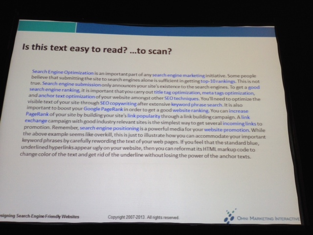
No!
Be careful about using Grey. A lot of people don’t recognize grey as clickable.
Don’t format your clickable and nonclickable text to look alike. This is a bad user experience and for SEs this looks like spam.
2) Easy to navigate
(People scan before they read; can humans understand your content as well as technology?) All clickable text should look clickable, all not clickable text should look NOT clickable.
Easy to navigate answers the questions: Where am I? Where can I go? How Can I get there?
Make it easy for people to decide which link to click on.

Be careful about putting navigation in the “Banner blindness” zone
Apple Germany and Apple UK = really good examples of navigations that rock.
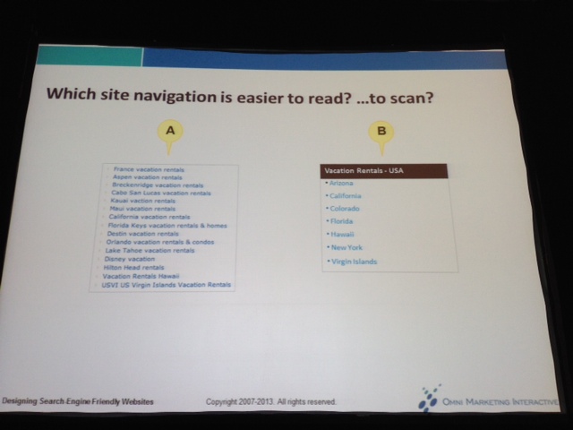
TEST: Which site navigation is easier to read?
Types of site navigation schemes (from most to least SE friendly)
Text links
Navigation buttons
Image maps
Menus (form and DHTML)
Flash
Expanding and collapsing navigations (The ones that show the + and – sign) are the WORST for Search Engines).
Flyout menus have the most errors; dropdown menus tend to have the least amount of errors.
MegaMenus tend to lose up to 20% revenue! If you NEED to do a MegaMenu, the FoodNetwork has a good example that is SE friendly and user friendly.
If you give people too FEW choices, it ticks off users. But if you give them too MANY choices, they are also ticked off because they don’t know where to begin. You want something in between; that “in between” you will feel out with testing.
[Having trouble condensing your MegaMenu? Hire an information architect; that’s what they do. It’s called a “card sort test” and there’s two types; open and closed. You need both of them.]
If a site navigation scheme is NOT search engine friendly should you not use it? NO! USER EXPERIENCE FIRST! If your users like to use the navigation, use it, but make sure to include text links as well.
Always try to have some form of text navigation on your website. A fat footer can be really helpful WHEN DONE RIGHT.
Really big websites need to have a site index as opposed to a site map.
3) Easy to find.
Before people can interact with your website they have to find your website.
If you don’t want people to notice something, put it in the lower right hand corner of the screen. People are less likely to look down there.
After arriving people don’t mind clicking through pages as long as they feel like they are making progress.
4) Consistent in layout, design and labeling
This is how SEs are able to determine the “aboutness” of your website. Layout/design/labeling communicates trust…
5) Quick to download
There’s actual download time and perceived download time. The latter is more important than the former. If people get their keywords validated they will regard the download time as good; if they don’t get what they want they will perceive the time as slow.
Perceived download time depends on context:

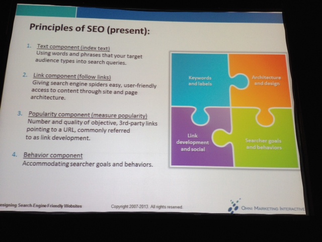
How Search Engines Read Websites
- Index text
- Follow links
- Measure popularity
- Accommodate searcher goals and behaviors
Are people saying the same or similar things about your website as you are saying about your website? (This is where inbound link and “link building” is very important.)
Searcher goals are HUGELY important! Does your searcher want navigational, information (63-80% of SE queries), or transactional (24-24%) queries. Shari calls these “Go, Know or Do” goals.

What kind of text should you use on your website?
Primary Text – ALL Search Engines read and use to determine relevancy
- Title tags (spell out your abbreviations in your title tag if there is room!)
- Body copy
- Text at the top of the web page
- Text In and around hyper links
Secondary text – SOME search engines read an duse to determine relevancy
- Meta tag content (VERY important for video optimization)
- Alt text
- Domain and file names
Primary text items are more important than secondary text elements. Make sure to place keywords in your titles, visible body text, anchor text , meta tags and ALT text.
These are all no nos:
Mobile
Mobile users read! (shocker!)
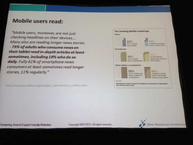
Do not assume responsive design is necessarily Search Engine friendly! Websites designed for mobile have to follow the same 5 rules for web design (covered above) as desktop websites.
Responsive design works well for some types of websites (a resterautn for instance), but most sites need to have a mobile-specific website created (IE: The Mayo Clinic website)
Responsive design DOES increase the download time of a website. Count the numbers of images; the number of scripts – those both bog down mobile websites.
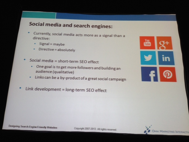
Popularity component
Social signals and popularity are both forms of validation. The idea is to get a quantity of quality links.
When you are logged in, Search Engines remember click popularity and adjust your SERP results based on that.
Some other random mishmash
Read this book! Emotional Design by Donald Norman
“I don’t expect you to KNOW everything, I just expect you to have an AWARENESS.”
Search engines don’t read punctuation marks
Right column should be at least 200px wide (if it’s less than that people tend to ignore it because they think the column is ads)
People tend to look three or four inches from the top of the screen; this is why the H1 is incredibly important.
Generally 7-12 FAQs per page is ok; after 16 it gets really hard to scan (which is a bad user experience.
People are going to decide to scroll during the first initial few seconds based on what’s visible. Which is one reason why it’s important to get the most important information above the fold. (Beyond the fold, Shari doesn’t recommend the page being longer than 2.5 screens.)
A lot of people ignore “banner blindness” ads (in the first 200px of the page)
FreeDictionary.com = bad ad saturation and placement
Mayo Clinic and ABC News = great ad saturation and placement
Search Engine Visibility = Shari’s book. Read it for more information on getting a PDF to rank.
26,000+ professionals, marketers and SEOs read the Bruce Clay Blog
Subscribe now for free to get:
- Expert SEO insights from the "Father of SEO."
- Proven SEO strategies to optimize website performance.
- SEO advice to earn more website traffic, higher search ranking and increased revenue.


7 Replies to “SMX Boot Camp: SEO Friendly Web Design (#smx #14A)”
Good tips on SEO friendly web design. I have to add some points that are important to take care in designing seo friendly website – Try to avoid using flash and frames on the page and always use eye soothing colors for background and text.
The most important part of SEO is perhaps having content relevant to your main page or site topic. The readable text on the page needs to be relevant to the targeted keywords and information in the meta tags and alt tags.The content needs to read well, in addition to being keyword dense, in order to be useful to a reader. Good read. Thanks
We’re designing a new website. Some of the points you’ve put in were great to learn! Any critiques guy’s? http://bit.ly/GzR1Qi
Excellent points. I hope many could follow this advice.
However, regarding the “Expanding and collapsing navigations” I guess you are referring to Javascript menus and Javascript is not so SE friendly, agreed. Unless you are referring to something completely different.
However, most of the modern techniques do use text links, so it should be ok. Best way to test it is to disable JS on the browser and see if the menu links appear. Or if it’s a website already indexed by Google, take a look at the cache version and check the “text only version”.
That way we can check whether our menu shows (SEO friendly) or not (definitely not SEO friendly).
Besides that, loved the advice.
Good supplemental JS advice/clarification, Xanthi! Love your troubleshooting advice.
One example of navigation that Shari gave that was user-friendly but needed an SEO text supplement was an interactive map of the United States; user’s loved to choose their state by clicking the colored map but (obviously) the design is bad-news-bears for SEO, so she recommended also including text links that name all the states below.
(by the way, Shari — the presenter of this session — is really awesome when it comes to web design/UX/optimization. Make sure to connect with her on Twitter @sharithurow)
Chelsea, would be interesting to get your view on the hummingbird and how it will change content marketing.
LEAVE A REPLY

Contact Us Now.


