INTERNATIONAL: Mobile Website Design Optimization Rules of Thumb!
By Siddharth Lal, December 2, 2011
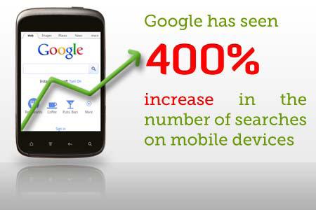
The smart phone revolution is truly upon us, and for those companies that haven’t engaged in planning their mobile website, this is a wake-up call. Today, smart phones have become an extension of the desktop experience. Let me present some interesting trivia via the graphic below, to get you thinking about your mobile business strategy.
Also, consider this announcement Google recently made:
“In the coming weeks, we will be introducing the mobile optimization of a website as a new factor of ads quality for AdWords campaigns that are driving mobile search traffic. As a result of this change, ads that have mobile optimized landing pages will perform better in AdWords — they will generally drive more mobile traffic at a lower cost.”
Mobile Website Development Checklist
The following are some issues that need to be considered when creating a dedicated mobile website.
Screen size: Most websites are designed for users with a minimum screen width of 1024 pixels and render well on laptops/desktop. However the real estate available on smart phones is about 320 pixels or greater, which will render well on screens as small as 3 inches.
Flash: Does your website have some parts developed in Flash? A huge number of mobile devices are unable to render Flash (think iPhone, iPad and older Android mobiles). Further, Adobe recently announced that they will no longer continue to develop Flash Player in the browser to work with new mobile device configurations.
Recommendation: In order to make sure your website can be viewed on devices such as the iPhone, use JavaScript and HTML5 in place of Flash.
The rule of thumb: Unlike desktop/laptop users, mobile internet users do not have a mouse to help them interact with the site. Generally they are holding the device with one hand and navigating with the index finger, or in case of one-handed usage, then navigation by default is by the ubiquitous thumb.
Recommendation: Remember to design your mobile website with the “rule of thumb” in mind. Simplify navigation to include top landing pages in the mobile site as large buttons that can be easily pressed by the thumb.
Heavy images and JavaScript: Check your website to see if it has heavy images or JavaScript, you will need to optimize these to reduce the load time of the website on the mobile devices.
Recommendation: Purge all the unnecessary JavaScript that may not be required and using CSS3 for basic transitions and animations instead. Reduce the size of images as mobile phones have a lower resolution than desktops. Save the images in PNG 8bit, JPEG, GIF.
Content: Remember the real estate available on mobile devices is minimal, therefore you need to recalibrate your content accordingly. Replace verbose text with bullet points. It might also be necessary to divide the page so that the user is not required to infinitely scroll vertically. Consider breaking up the content naturally into multiple pages. Another option is to try not to replicate your entire website, instead putting up content that is the most important to a mobile user.
Responsive design: Use fluid grid responsive design and media queries to allow the mobile website to render aesthetically on all mobile devices irrespective of resolution.
Navigation: Make sure you include a clearly visible home and back button on the top and bottom of the page. You may also want to include a “scroll to top” button at the bottom of each page. Make sure the website is designed in a manner that doesn’t require the user to scroll in both directions (horizontal and vertical), restricting it to vertical alone.
Detecting and redirecting mobile users: It is important to detect mobile devices requesting the website and redirect them to the correct mobile website. This can be accomplished by detecting the user-agent in the server header sent by the end user’s browser. If the user-agent resembles a mobile phone browser, then the user is redirected to the closest matching page on the mobile website. It is absolutely acceptable to give the user an experience tailored to his device and is not considered cloaking by Google.
Cloaking and Googlebot-Mobile: You will need to make sure that Googlebot-Mobile is redirected to the mobile website, whereas it is not necessary to redirect Googlebot to the desktop version. For instance, Google doesn’t automatically redirect desktop users from their mobile site to their desktop site, instead they include a link on the mobile-version page to the desktop version.
These links are especially helpful when a mobile site doesn’t provide the full functionality of the desktop version — users can easily navigate to the desktop-version if they prefer. This will help your website avoid cloaking issues. More info about this issue can be found here.
Mobile sitemaps: It is important to submit a mobile sitemap to Google Webmaster Tools. This will allow Google to index all the URLs in the mobile website properly.
Does the URL matter? Some of you might want to serve content to both mobile and desktop users from the same URL (www.example.com) whereas others might use a dedicated URL for mobile users (mobile.example.com). For Googlebot and Googlebot-Mobile it does not matter what the URL structure is as long as it returns exactly what a user sees. Regardless of URL structure, you must correctly detect the user-agent as given by your users and Googlebot-Mobile and serve both the same content.
Native app or dedicated mobile site? Should your company design a dedicated mobile website or design a native application? Native apps are very popular these days, however I prefer the experience of dedicated website. Previously, apps offered better technology; however HTML5 offers a good alternative these days, and you don’t need to go through the hassle of getting your changes approved in the Android/Apple marketplace each time there is an update on your website.
You will often have to build the app for each platform (iPhone, Android, Blackberry, Windows Phone) from scratch. Therefore the cost of doing this exercise can be prohibitive. You will need to find a developer who specializes in building apps for each of these platforms, and this restricts your reach unless you plan on going the whole hog.
Further you will need to go through an approval process and each time you make a change you will go through the process again. The main advantage of going with a dedicated mobile website is that it is compatible across all platforms and devices. This gives you more reach at a cheaper cost and you can use your developers’ existing skill set to develop the site. The site can be updated in real time.
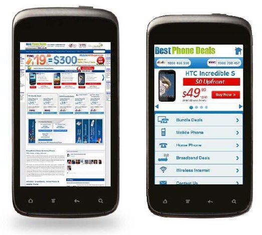
Compare the above website before mobile design optimization on the left and after mobile design optimization on the right. By not having a dedicated mobile website you are leaving money on the table. So folks, it is time to jump on the mobile Internet bandwagon.
Following is a list of resources that you will find helpful in your journey of mobilizing your website:
- Making Websites Mobile Friendly on the Google Webmaster Central Blog
- Does indexing a mobile site create duplicate content issues? Matt Cutts answers this in a short video.
- Google’s advice for getting your site ready for mobile-first indexing
- 7 Mobile-Friendly Navigation Best Practices
- Mobile SEO and UX Optimization tips from our SEO Guide
Contact Siddharth on LinkedIn or @SiddLal on Twitter.


