
 --%3E%3Csvg version='1.1' id='_x3C_Layer_x3E_' xmlns='http://www.w3.org/2000/svg' xmlns:xlink='http://www.w3.org/1999/xlink' x='0px' y='0px' viewBox='0 0 234.24 234.24' style='enable-background:new 0 0 234.24 234.24;' xml:space='preserve'%3E%3Crect x='0.029' y='0.008' style='fill:%231972B9;' width='234.24' height='234.24'/%3E%3Cg%3E%3Cg%3E%3Cpath style='fill:%23FFFFFF;' d='M24.3,63.466l-0.268-0.235v-1.679l0.268-0.235c3.828,0.179,6.782,0.269,8.865,0.269 c0.782,0,5.315-0.09,10.734-0.269c1.745-0.044,3.009-0.066,3.794-0.066c3.023,0,5.417,0.301,7.186,0.905 c1.769,0.605,3.189,1.673,4.264,3.208c1.074,1.533,1.612,3.274,1.612,5.221c0,2.485-0.895,4.791-2.686,6.916 c-1.791,2.128-4.7,3.65-8.729,4.568c2.417,0.223,4.41,0.549,5.977,0.972c1.566,0.425,2.921,1.08,4.061,1.966 c1.142,0.884,2.043,2.03,2.704,3.44c0.66,1.41,0.991,3.045,0.991,4.904c0,1.454-0.225,2.933-0.672,4.433 c-0.448,1.498-1.27,2.987-2.468,4.466c-1.198,1.476-2.646,2.742-4.348,3.793c-1.701,1.052-3.441,1.815-5.222,2.283 c-1.78,0.47-3.99,0.705-6.631,0.705c-0.537,0-3.582-0.056-6.268-0.168c-2.979-0.067-4.59-0.099-4.835-0.099 c-1.523,0-3.393,0.088-5.608,0.267l-0.269-0.267v-1.109l0.269-0.334c1.298-0.583,2.048-0.986,2.249-1.21 c0.201-0.222,0.365-2.205,0.488-5.942c0.123-3.74,0.185-6.594,0.185-8.564V79.281l-0.034-7.622c0-1.657-0.022-3.006-0.067-4.046 c-0.045-1.042-0.106-1.785-0.185-2.234c-0.077-0.446-0.206-0.761-0.385-0.94s-0.431-0.329-0.756-0.453 c-0.324-0.123-0.878-0.229-1.662-0.32L24.3,63.466z M36.355,81.095c1.119,0.09,2.384,0.135,3.795,0.135 c4.633,0,9.289-0.828,11.103-2.486c1.813-1.656,2.719-3.929,2.719-6.815c0-1.679-0.347-3.106-1.042-4.283 c-0.693-1.174-1.785-2.076-3.274-2.702c-1.488-0.628-4.941-0.942-7.493-0.942c-2.081,0-3.918,0.169-5.507,0.504 c-0.202,2.015-0.302,5.529-0.302,10.543V81.095z M36.422,105.573c1.724,0.403,3.493,0.604,5.305,0.604 c3.2,0,7.142-0.515,8.954-1.543c1.814-1.031,3.15-2.458,4.013-4.283c0.861-1.825,1.293-3.811,1.293-5.96 c0-3.223-0.911-5.802-2.736-7.739c-1.824-1.937-7.202-2.904-13.27-2.904c-1.007,0-2.216,0.044-3.626,0.133v11.452L36.422,105.573z '/%3E%3Cpath style='fill:%23FFFFFF;' d='M68.331,108.914v-1.589l0.44-0.325l0.108-0.004c1.568-0.066,2.622-0.15,3.133-0.246 c0.632-0.119,0.837-0.253,0.895-0.307c0.055-0.048,0.197-0.225,0.324-0.827c0.106-0.491,0.168-1.636,0.185-3.404l0.026-5.311 v-11.66l-0.052-4.907c-0.015-1.887-0.063-3.117-0.137-3.656c-0.09-0.655-0.223-0.862-0.274-0.921 c-0.063-0.071-0.248-0.213-0.757-0.342c-0.299-0.078-1.123-0.185-3.342-0.267l-0.125-0.004l-0.425-0.366V73.19l0.439-0.375 l0.14,0.006c3.115,0.133,5.572,0.202,7.305,0.202c1.922,0,4.555-0.06,7.822-0.176c1.224-0.035,2.109-0.05,2.659-0.05 c4.473,0,7.438,0.792,9.065,2.421c1.604,1.608,2.417,3.54,2.417,5.744c0,1.464-0.395,2.921-1.177,4.327 c-0.778,1.406-1.941,2.622-3.455,3.615c-1.397,0.915-3.3,1.627-5.661,2.121c0.506,0.674,1.256,1.654,2.254,2.938l3.649,4.736 c1.182,1.562,2.449,3.208,3.799,4.946c1.728,2.22,2.318,2.742,2.516,2.857c0.357,0.204,0.659,0.33,0.9,0.374 c0.259,0.046,0.693,0.068,1.285,0.068h0.146l0.418,0.41v1.484l-0.463,0.453l-0.171-0.021c-0.804-0.099-1.775-0.15-2.885-0.15 c-1.203,0-2.533,0.05-3.956,0.151l-0.183,0.013l-0.116-0.14c-1.181-1.406-3.06-3.88-5.59-7.347 c-2.921-3.999-5.957-7.76-9.019-11.179l-0.139-0.155l0.409-1.238l0.275,0.017c0.881,0.048,1.568,0.074,2.06,0.074 c2.863,0,5.129-0.676,6.732-2.009c1.608-1.333,2.388-3.138,2.388-5.516c0-2.118-0.693-3.666-2.118-4.738 c-1.437-1.081-3.421-1.629-5.898-1.629c-1.695,0-3.317,0.225-4.823,0.667c-0.103,0.409-0.29,2.149-0.29,9.15v11.661l0.025,4.908 c0.016,1.868,0.068,3.086,0.149,3.625c0.102,0.656,0.235,0.865,0.288,0.925c0.064,0.074,0.249,0.218,0.764,0.357 c0.298,0.081,1.117,0.196,3.335,0.278L83.739,107l0.44,0.325v1.589l-0.417,0.41h-0.148c-0.086,0-1.596-0.052-4.533-0.153 c-1.209-0.032-2.156-0.05-2.84-0.05c-0.525,0-2.991,0.067-7.336,0.203l-0.152,0.004L68.331,108.914z'/%3E%3Cpath style='fill:%23FFFFFF;' d='M123.441,110.053c-2.372,0-4.505-0.267-6.332-0.795c-1.844-0.532-3.322-1.249-4.397-2.132 c-1.078-0.887-1.864-1.838-2.337-2.829c-0.468-0.982-0.776-2.148-0.914-3.467c-0.136-1.29-0.204-3.282-0.204-5.917v-9.671 l-0.052-4.909c-0.015-1.89-0.061-3.12-0.134-3.656c-0.089-0.655-0.218-0.864-0.268-0.923c-0.063-0.072-0.241-0.212-0.738-0.341 c-0.294-0.075-1.1-0.183-3.274-0.264l-0.127-0.006l-0.418-0.367v-1.584l0.43-0.376l0.141,0.005c4.141,0.133,6.56,0.2,7.192,0.2 c0.564,0,2.991-0.067,7.217-0.2l0.141-0.005l0.43,0.376v1.584l-0.42,0.368l-0.129,0.005c-1.145,0.033-2.038,0.083-2.655,0.148 c-0.711,0.075-1.054,0.217-1.216,0.323c-0.109,0.071-0.305,0.298-0.407,1.044c-0.089,0.66-0.134,1.598-0.134,2.785l-0.05,5.795 v8.004c0,2.615,0.055,4.556,0.162,5.773c0.106,1.192,0.334,2.205,0.678,3.015c0.337,0.791,0.858,1.483,1.55,2.055 c0.694,0.579,1.719,1.061,3.04,1.43c1.34,0.376,2.882,0.565,4.588,0.565c1.802,0,3.506-0.252,5.065-0.75 c1.533-0.49,2.711-1.203,3.503-2.121c0.791-0.921,1.319-2.152,1.567-3.666c0.257-1.559,0.385-3.764,0.385-6.552v-7.757 c0-1.308-0.022-3.107-0.063-5.396c-0.056-3.035-0.206-3.675-0.269-3.811c-0.12-0.261-0.348-0.457-0.692-0.6 c-0.265-0.107-1.074-0.246-3.434-0.286l-0.145-0.003l-0.408-0.408v-1.469l0.407-0.458l0.172,0.01c2.467,0.133,4.468,0.2,5.95,0.2 c1.264,0,3.257-0.067,5.924-0.2l0.147-0.008l0.456,0.406v1.53l-0.446,0.397l-0.132,0.003c-1.55,0.033-2.569,0.095-3.024,0.182 c-0.507,0.099-0.731,0.229-0.828,0.322c-0.141,0.136-0.25,0.366-0.327,0.681c-0.059,0.248-0.137,1.012-0.179,3.248l-0.076,5.665 v7.65c0,3.059-0.119,5.507-0.355,7.277c-0.242,1.812-0.794,3.328-1.638,4.507c-0.835,1.161-1.84,2.146-2.986,2.93 c-1.148,0.786-2.633,1.398-4.414,1.817C127.199,109.843,125.341,110.053,123.441,110.053'/%3E%3Cpath style='fill:%23FFFFFF;' d='M166.203,110.053c-6.125,0-11.175-1.767-15.012-5.255c-3.845-3.496-5.795-8.126-5.795-13.763 c0-3.881,0.972-7.326,2.893-10.234c1.917-2.905,4.483-5.109,7.629-6.551c3.129-1.434,6.693-2.16,10.588-2.16 c2.248,0,4.502,0.239,6.699,0.713c2.197,0.473,4.059,1.049,5.535,1.711l0.09,0.041l0.347,0.493l-0.075,0.182 c-0.371,0.903-0.726,3.215-1.057,6.871l-0.012,0.116l-0.36,0.411h-1.494l-0.402-0.402l-0.251-4.255 c-1.162-0.895-2.576-1.609-4.204-2.12c-1.694-0.532-3.485-0.802-5.321-0.802c-2.763,0-5.274,0.6-7.46,1.784 c-2.176,1.177-3.89,2.908-5.093,5.143c-1.208,2.245-1.821,5.038-1.821,8.304c0,3.28,0.722,6.194,2.143,8.66 c1.42,2.465,3.386,4.386,5.841,5.707c2.462,1.325,5.382,1.997,8.682,1.997c1.463,0,2.887-0.14,4.234-0.42 c1.344-0.28,2.476-0.625,3.361-1.033c0.89-0.408,1.755-0.915,2.572-1.501l0.275-0.197l0.775,0.954l-1.089,2.662l-0.119,0.06 C174.543,109.084,170.471,110.053,166.203,110.053'/%3E%3Cpath style='fill:%23FFFFFF;' d='M184.053,108.912v-1.104l0.328-0.411l0.069-0.035c1.341-0.681,1.583-0.856,1.626-0.893 c-0.012-0.042,0.118-0.694,0.23-4.151c0.092-2.794,0.139-4.956,0.139-6.423v-9.242l-0.026-5.715c0-1.238-0.016-2.245-0.05-3.021 c-0.032-0.752-0.087-1.293-0.167-1.603c-0.092-0.371-0.178-0.514-0.219-0.566c-0.048-0.057-0.15-0.145-0.378-0.231 c-0.148-0.056-0.469-0.139-1.161-0.218l-2.019-0.16l-0.413-0.361v-1.585l0.428-0.374l0.138,0.003 c5.731,0.099,9.447,0.15,11.05,0.15c5.477,0,10.423-0.052,14.698-0.15l0.19-0.004l0.333,0.466l-0.042,0.163 c-0.411,1.582-0.722,4.107-0.922,7.51l-0.006,0.109l-0.323,0.43h-1.549l-0.467-0.414l0.021-0.185 c0.014-0.136,0.022-0.256,0.022-0.364c0-1.329-0.098-2.616-0.291-3.827c-1.003-0.41-2.38-0.684-4.101-0.814 c-1.854-0.142-3.264-0.213-4.19-0.213c-1.241,0-2.833,0.082-4.738,0.247l-0.091,3.709l-0.146,9.373 c1.669,0.087,3.231,0.132,4.649,0.132c1.524,0,2.818-0.05,3.844-0.148c1.379-0.134,1.636-0.243,1.673-0.263 c0.094-0.059,0.18-0.207,0.245-0.428c0.086-0.286,0.162-0.817,0.227-1.577l0.108-1.689l0.403-0.401h1.454l0.414,0.414 l-0.003,0.152c-0.034,1.831-0.076,3.67-0.126,5.519l0.129,5.801l-0.414,0.416h-1.454l-0.396-0.396l-0.19-1.634 c-0.183-1.428-0.272-1.9-0.315-2.043c-0.043-0.147-0.15-0.277-0.325-0.399c-0.087-0.059-0.429-0.211-1.71-0.34 c-0.99-0.101-2.376-0.15-4.119-0.15c-0.916,0-2.289,0.038-4.118,0.111c-0.071,1.427-0.107,3.68-0.107,6.709 c0,3.271,0.036,5.766,0.108,7.422h4.293c4.049,0,6.613-0.05,7.621-0.148c0.93-0.092,1.829-0.309,2.674-0.646 c0.148-0.429,0.376-1.268,0.679-2.496c0.337-1.384,0.536-2.255,0.583-2.595l0.022-0.155l0.471-0.33h1.457l0.46,0.403l-0.043,0.206 c-0.145,0.704-0.291,1.96-0.434,3.734c-0.143,1.777-0.213,3.319-0.213,4.578v0.134l-0.376,0.431l-0.169-0.006 c-3.189-0.099-7.421-0.15-12.581-0.15l-6.852-0.052c-1.575,0-3.244,0.067-4.956,0.201l-0.165,0.011L184.053,108.912z'/%3E%3C/g%3E%3Cg%3E%3Cpath style='fill:%23FFFFFF;' d='M89.628,166.088l-1.251,3.124c-4.869,2.528-10.068,3.793-15.597,3.793 c-7.92,0-14.352-2.293-19.299-6.883c-4.947-4.589-7.421-10.587-7.421-17.997c0-5.105,1.234-9.564,3.702-13.381 c2.468-3.817,5.725-6.671,9.773-8.562c4.048-1.892,8.595-2.838,13.64-2.838c2.919,0,5.804,0.314,8.655,0.939 c2.851,0.628,5.231,1.377,7.141,2.251l0.231,0.335c-0.505,1.254-0.978,4.354-1.416,9.301l-0.231,0.269H86.01l-0.264-0.269 l-0.329-5.708c-1.603-1.298-3.538-2.311-5.809-3.039c-2.271-0.728-4.634-1.092-7.091-1.092c-3.708,0-7.032,0.811-9.97,2.434 c-2.941,1.623-5.221,3.974-6.847,7.052c-1.62,3.079-2.433,6.844-2.433,11.3c0,4.477,0.954,8.404,2.862,11.785 c1.909,3.382,4.515,5.977,7.815,7.79c3.3,1.813,7.157,2.72,11.567,2.72c1.952,0,3.828-0.189,5.627-0.571 c1.799-0.38,3.296-0.851,4.491-1.41c1.196-0.56,2.342-1.242,3.439-2.047L89.628,166.088z'/%3E%3Cpath style='fill:%23FFFFFF;' d='M93.747,171.912v-1.104l0.327-0.41l0.067-0.036c1.337-0.688,1.574-0.866,1.614-0.904 c-0.011-0.025,0.087-0.518,0.221-3.026c0.108-2.033,0.162-4.518,0.162-7.385v-10.804l-0.05-4.908 c-0.017-1.89-0.063-3.121-0.134-3.658c-0.09-0.655-0.218-0.863-0.269-0.921c-0.062-0.071-0.241-0.212-0.74-0.341 c-0.292-0.076-1.098-0.183-3.272-0.265l-0.127-0.006l-0.418-0.366v-1.585l0.431-0.375l0.14,0.004 c4.14,0.133,6.559,0.201,7.191,0.201c0.565,0,2.991-0.068,7.217-0.201l0.14-0.004l0.431,0.375v1.585l-0.42,0.368l-0.129,0.004 c-1.145,0.033-2.037,0.083-2.656,0.149c-0.711,0.075-1.052,0.216-1.217,0.323c-0.106,0.07-0.302,0.298-0.404,1.044 c-0.091,0.661-0.136,1.597-0.136,2.785l-0.05,5.794v11.129c0,2.783,0.017,4.726,0.05,5.831l0.115,4.01h4.791 c4.066,0,6.635-0.05,7.633-0.148c0.926-0.092,1.832-0.311,2.695-0.649c0.171-0.456,0.414-1.363,0.719-2.7 c0.442-1.949,0.523-2.444,0.532-2.565l0.011-0.147l0.436-0.388h1.534l0.4,0.457l-0.035,0.171c-0.13,0.655-0.267,1.953-0.41,3.862 c-0.143,1.911-0.213,3.478-0.213,4.656v0.148l-0.417,0.417l-0.154-0.006c-3.172-0.099-7.396-0.15-12.555-0.15l-7.357-0.052 c-1.659,0-3.377,0.067-5.107,0.201l-0.165,0.011L93.747,171.912z'/%3E%3Cpath style='fill:%23FFFFFF;' d='M160.736,172.322c-1.762-0.15-3.369-0.225-4.779-0.225c-2.777,0.085-5.566,0.159-8.353,0.227 l-0.153,0.004l-0.415-0.415v-1.606l0.408-0.409l0.144-0.003c2.296-0.041,3.138-0.146,3.441-0.227 c0.386-0.104,0.439-0.311,0.439-0.522c0-0.323-0.109-0.772-0.327-1.331l-3.005-7.453h-14.104l-2.651,6.229 c-0.466,1.107-0.702,1.915-0.702,2.402c0,0.185,0.053,0.423,0.467,0.604c0.28,0.126,1.076,0.277,3.284,0.297l0.133,0.003 l0.448,0.396v1.619l-0.42,0.423l-0.162-0.011c-2.148-0.133-4.055-0.2-5.669-0.2c-1.83,0-3.702,0.067-5.566,0.2l-0.151,0.011 l-0.459-0.409v-1.633l0.446-0.396l0.133-0.003c1.477-0.02,2.048-0.104,2.267-0.173c0.29-0.088,0.543-0.266,0.777-0.543 c0.176-0.207,0.6-0.919,1.623-3.13l2.646-5.74l6.847-15.509c1.291-3.035,2.574-6.072,3.85-9.11l0.092-0.219h2.113l12.28,28.876 c0.417,0.951,0.898,1.987,1.44,3.106c0.716,1.472,0.981,1.812,1.061,1.889c0.172,0.165,0.392,0.294,0.652,0.386 c0.187,0.066,0.68,0.148,1.964,0.168l0.145,0.003l0.409,0.409v1.606l-0.424,0.425L160.736,172.322z M146.857,157.478 l-5.787-13.902l-5.879,13.902H146.857z'/%3E%3Cpath style='fill:%23FFFFFF;' d='M166.505,171.912v-1.585l0.434-0.326l0.11-0.006c1.57-0.064,2.609-0.147,3.093-0.243 c0.572-0.115,0.778-0.241,0.849-0.307c0.067-0.06,0.196-0.236,0.307-0.742c0.095-0.435,0.151-1.364,0.168-2.76l0.051-4.307v-4.782 c-0.334-0.749-1.571-2.927-3.65-6.335l-2.215-3.6c-0.698-1.13-1.588-2.467-2.646-3.974c-1.047-1.491-1.864-2.515-2.43-3.04 c-0.677-0.629-1.035-0.824-1.216-0.875c-0.161-0.048-0.696-0.125-2.47-0.125h-0.148l-0.437-0.437v-1.354l0.413-0.412l7.385-1.227 l0.12,0.083c0.523,0.367,1.041,0.835,1.536,1.39c0.495,0.558,1.191,1.559,2.125,3.058c0.915,1.467,2.109,3.542,3.548,6.162 c1.336,2.431,2.639,4.899,3.878,7.342l2.229-3.545l2.892-4.828l5.454-9.338l0.231,0.025c0.638,0.064,1.271,0.099,1.876,0.099 c0.379,0,0.957-0.034,1.732-0.099l0.167-0.014l0.424,0.424v0.765l-0.094,0.102c-0.826,0.91-2.131,2.59-3.878,4.994 c-1.75,2.408-3.071,4.317-3.929,5.672c-0.863,1.367-1.924,3.086-3.182,5.157c-1.54,2.537-1.952,3.384-2.026,3.652 c-0.109,0.385-0.164,0.854-0.164,1.389v3.702l0.025,3.775c0.017,1.434,0.07,2.446,0.16,3.007c0.113,0.708,0.25,0.904,0.29,0.949 c0.063,0.07,0.241,0.204,0.732,0.334c0.287,0.077,1.086,0.183,3.26,0.264L181.62,170l0.435,0.326v1.585l-0.413,0.411h-0.148 c-0.084,0-1.566-0.05-4.445-0.15c-1.185-0.035-2.114-0.052-2.783-0.052c-0.53,0-2.951,0.068-7.191,0.201l-0.155,0.006 L166.505,171.912z'/%3E%3Cpath style='fill:%23FFFFFF;' d='M190.461,172.648c-0.73,0-1.434-0.193-2.089-0.568c-0.656-0.378-1.167-0.898-1.518-1.55 c-0.35-0.646-0.526-1.633-0.526-2.323c0-0.693,0.176-1.062,0.526-1.707c0.35-0.646,0.86-1.168,1.518-1.547 c0.653-0.379,1.359-0.571,2.089-0.571c0.729,0,1.422,0.186,2.06,0.554c0.638,0.365,1.147,0.877,1.517,1.519 c0.367,0.641,0.553,1.333,0.553,2.061c0,0.737-0.186,1.431-0.553,2.068c-0.367,0.636-0.877,1.146-1.511,1.511 C191.891,172.461,191.196,172.648,190.461,172.648 M190.461,165.157c-0.594,0-1.167,0.157-1.701,0.462 c-0.533,0.305-0.947,0.728-1.23,1.254c-0.284,0.531-0.43,1.083-0.43,1.644c0,0.577,0.147,1.132,0.438,1.657 c0.288,0.522,0.698,0.942,1.224,1.244c0.526,0.306,1.097,0.459,1.698,0.459c0.592,0,1.154-0.15,1.675-0.448 c0.518-0.296,0.935-0.712,1.234-1.234c0.301-0.52,0.452-1.086,0.452-1.678c0-0.599-0.151-1.163-0.452-1.679 c-0.299-0.516-0.715-0.93-1.231-1.23C191.62,165.308,191.056,165.157,190.461,165.157 M192.117,170.692 c-0.211,0-0.372-0.025-0.495-0.077c-0.133-0.055-0.252-0.169-0.354-0.34c-0.088-0.15-0.225-0.454-0.407-0.91 c-0.113-0.291-0.188-0.417-0.231-0.476c-0.056-0.073-0.115-0.126-0.175-0.157c-0.027-0.014-0.118-0.046-0.396-0.046H189.9v1.227 c0,0.221,0.016,0.276,0.018,0.281c0.021,0.018,0.063,0.038,0.225,0.038l0.288,0.011v0.448h-1.95v-0.448l0.287-0.011 c0.165,0,0.207-0.017,0.211-0.02c0.02-0.034,0.035-0.097,0.035-0.299v-3.078c0-0.234-0.024-0.29-0.024-0.291 c-0.032-0.018-0.102-0.031-0.369-0.033l-0.14-0.003v-0.456h1.942c0.269,0,0.519,0.024,0.744,0.073 c0.239,0.052,0.42,0.12,0.551,0.215c0.13,0.092,0.239,0.221,0.326,0.385c0.085,0.165,0.127,0.35,0.127,0.55 c0,0.316-0.113,0.599-0.343,0.839c-0.148,0.155-0.347,0.276-0.595,0.361c0.004,0.003,0.008,0.006,0.013,0.008 c0.105,0.081,0.207,0.197,0.306,0.355c0.092,0.146,0.21,0.378,0.35,0.694c0.178,0.406,0.276,0.549,0.318,0.598 c0.071,0.083,0.218,0.103,0.33,0.108l0.137,0.004v0.449H192.117z M190.059,168.179c0.429,0,0.747-0.067,0.939-0.204 c0.179-0.126,0.267-0.33,0.267-0.618c0-0.551-0.283-0.807-0.89-0.807h-0.316c-0.095,0-0.123,0.013-0.123,0.013 c-0.025,0.026-0.035,0.067-0.035,0.246v1.371H190.059z'/%3E%3C/g%3E%3C/g%3E%3C/svg%3E%0A)

How to Make a Graphic-Text Mash-up to Promote Blog Content on Facebook
I’m in a few Google+ groups focused on SEO, social media, and content marketing. The question of what stock photo service to use and where to get free images has come up a couple times. It got me thinking about the process I use to find, modify, and use images in my day-to-day.
As a community manager and a blogger, I have 2 main needs for images:
- Including them in BCI blog posts to break up text and add visual interest
- Posting images to social media to share blog and other BCI content
What you’ll know by the end of reading this is:
- Where I get images, both free and paid services
- How to make a graphic-text mash-up using Google Drive that will get noticed in the midst of noisy Facebook, Twitter, and Google+ streams
Free Images and Paid Stock Photo Services
The stock photo site I use is Dreamstime.com because the price is right and the selection passes muster. If you use advanced search to set the price slider bar to the lowest setting, you’ll find images available for 1 credit in the extra small size. Extra small is usually around 480 px by 320 px, which is fine for both my purposes (blog posts and social media posts).
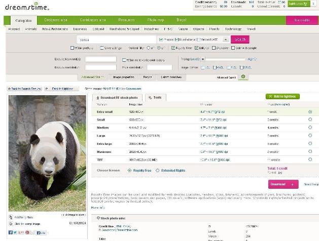
Credits will run you $1.36 if you buy the smallest credit package down to about $1 if you buy 120 credits at a time; 250+ credit packages save you even more cents.
Other Stock Photo Services
I checked out some stock photo site comparisons to get an idea of what else is out there and how they stack up. In 6 Stock Photography Services Compared I learned that FREEIMAGES is the most popular free stock photo library, yet it has a limited selection. Among the most popular paid services, iStockphoto has the most massive library and Getty Images has a complicated pricing and licensing scheme.
Getting Images for Free Online
As long as you’re not looking for high-res or print quality images, you’ve got some good, free options online.
Creative Commons
When using images with Creative Commons licenses, the attribution requirement adds a hurdle to the graphic mash-up use for images I describe later since it adds another element to what must be included in the graphic. But, CC images are great for blog posts.
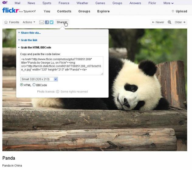
For a long time, I used Creative Commons licensed photos on Flickr that allow commercial use and derivatives. For use in blog posts, Flickr makes it easy to use Creative Commons licensed images, and the “share” function gives you HTML code including the required attribution. The Creative Commons site search includes Flickr, Google Images, Open Clip Art Library and Pixabay for images, and a number of media and music sources as well.

You can also search Wikimedia‘s library of free images, a collection with Creative Commons copyrights, free documentation licenses or no copyright.
For free images you can also search EveryStockPhoto.com, a search engine for free photos across a number of sources and including a variety of license types.
Public Domain
You can also search Flickr’s collection The Commons, images that have passed into the public domain and belong to everyone, mostly due to their being old. You’ll find awesome vintage photos, advertising, illustrations and art that have passed into public use and can give modern blog and social posts refreshing classic flare. Since they don’t have copyright or licensing requirements, you can use public domain images for the graphic mash-up use which we get into next!
The Graphic Text Mash-up Promo
This is my little trick for sharing blog posts on Twitter, Facebook, and Google+ to get a little more attention than straight text updates.
As you may have noticed, recent layout updates to Facebook and Google+ have put an emphasis on visual media. Skyrocketing mobile use of Facebook, along with other social media apps, was a big reason behind Facebook’s update last March. Images show up larger in the News Feed and may also get priority in the ranking algo. An update to Google+ around the same time also made images feature more heavily. And in the endlessly updating churn of a Twitter stream, a picture attachment makes tweets stand out and, as pictures are worth a thousand words, lets you extend your message past 140 characters.
The graphic should include these three vital components:
- Image to grab fan/follower attention within a feed or stream
- A link to drive a viewer to your site
- Text that promises a payoff from clicking through
You can opt to include a logo for branding purposes as well. Note that if there’s text in the logo, it would add to your text to image ratio which Facebook limits to 20% for ads and promoted content. More on that below.
Creating A Graphic with Google Drive
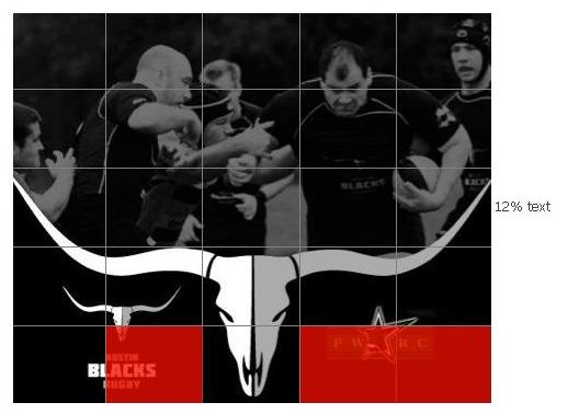
I use the drawing function in Google Drive to add text on top of images. It’s super easy and Google gives you a ton of font options as well as shapes, arrows, and call-outs you can add to the drawing. Here, you can see a graphic mash-up I created last week to promote our Thank You page series.

-
Sign in to Google Drive at https://drive.google.com/ and create a Drawing.
-
Insert an image that you own or one sanctioned for public use.
-
Create a custom short link to the content. If you’ve got a registered Bitly account you can customize links, and in the Elvis example here you can see I created a custom link “typagecro,” which I chose to suggest “Thank You page CRO” (conversion rate optimization). Another bonus of a registered Bitly account is that you can track clicks on your short links.
- Insert text on top of the image. These are elements #2 and #3 in my list of three critical components.
(#2) Include the custom short link, which a viewer can type into their address bar since it’s short and easy to understand. Of course, also include a hyperlink in the image caption or tweet.
(#3) Include a promise of what’s to come in the full article, or hint at what the full content contains. If it’s a “Top 3 Reasons Why…” post, then you may want include the three reasons right there in the image with an invitation to get all the info in the full post. In the Elvis example I included a brief description of what was covered in each of the two-parts of the Thank You page CRO series. Try to make this message seductive, whatever that means for you and your content.
- When the graphic is done, go to File > Download as > JPEG, and then save it.
A Quick Note About Design
I’ve taken one graphic design class, one web design class, and a handful of painting and photography classes, so while I’m not a professional designer, I’ve certainly been exposed to the rules of good composition. I think these are the basics to keep in mind when you’re creating mash-ups.
- Make sure text is clearly legible. Black on white is best. White on black is hard for the eye to process. If text is anything besides dark text on light, not-busy background, then make sure text is legible in other ways, such as increasing font thickness or putting a background color behind the text.
- Use no more than two font types. At least one should be extremely easy to read; sans serif fonts are generally easier to read online than serif fonts. The other font can be stylized, used as an accent, and in small amounts.
- For the most part, text should align left. It’s hard for the eye to follow a ragged left edge
- White space is a component of good design, especially in the modern aesthetic. While the graphic will likely be dense as you’re trying to communicate a lot in a little space, available white space should be a consideration in choosing the image.
If you want to get a background in some basics of design, I recommend Bootstrapping Design, a $39 ebook. It’s written for programmers, but I like it because it’s accessible design fundamentals for a non-artist set. Considering we’re in an age where everyone can publish online content, learning the basics of good design is an investment that will payoff.
Facebook Guidelines for Text in Images
 | 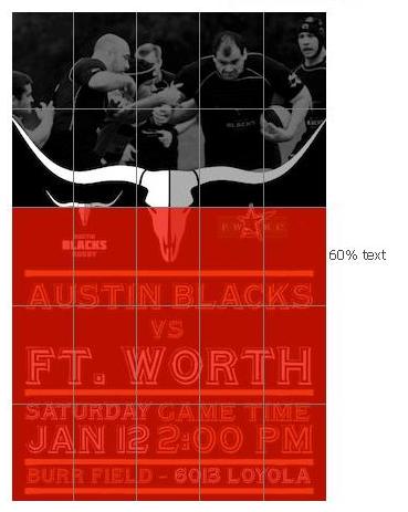 |
Shortly after Facebook’s update in March, it made a new rule limiting text in images used in ads, sponsored stories and Page cover photos to 20%. If you plan to “promote” the Facebook post including an image, pay to boost its visibility or turn it into an ad, the surface area of the image that includes text has to stay under 20%.

I’ll also note here that image posts as they’re displayed on a Facebook Wall favor portrait orientation and will cut off the left and right sides of landscape oriented images. If you’re using a landscape image, then try to keep the text within the area that is “center square” to the height of the image. I’ve illustrated the center square in this drawing.
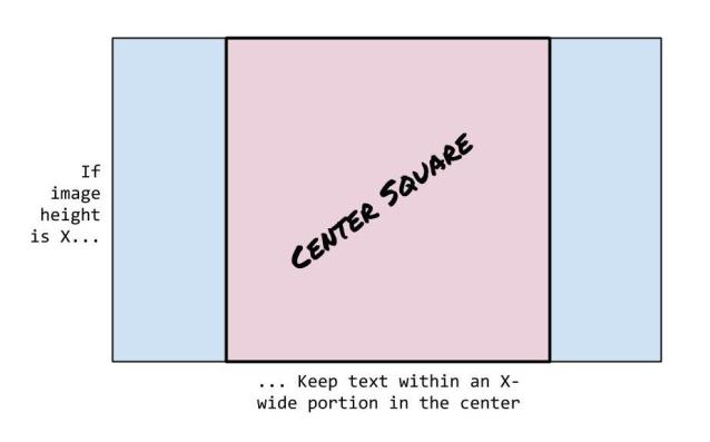
Yep, I made that in Google Drive, too.
Interested in more design tips?
Learn how you can Create an Infographic for Free!


5 Replies to “How to Make a Graphic-Text Mash-up to Promote Blog Content on Facebook”
Hi Schriftarten,
Thanks for your question! Canva is a very popular graphic design application that is easy to use and produces great social graphics and other assets very quickly. Other alternatives include Snappa, Piktochart and Pixlr.
You may also consider using AI tools such as Midjourney or DreamStudio.
Wow, lots of great info here. With all the free image sources you provided, it will be easy to get started without having to buy stock photos.
Thanks for sharing your graphic ninja tricks, Virginia! Your insights are super! Can’t wait to play and promote!
LEAVE A REPLY

Contact Us Now.


